Wednesday, April 22, 2009

I'd like to thank all the little people...

Recognition: ain't it great?

I like a lot of my images. But it's SO much better when other people acknowledge that they like them too. So, without further ado (but a virtual drumroll...)

My Mountain Man digital painting took FIRST PLACE in the ADVANCED CATEGORY at the Richmond Hill Camera Club Print Competition this week.

It wasn't the printing quality: All the prints in the competition were put on paper by Costco, all to fit within the same size mat.Three professional judges loved my picture.

Ah, the glory. The adulation. The women falling all over themselves just to be near me... OK, but I'm still proud of the work I did on that picture and I do want to thank Hilarie for teaching me how.

PS. Scroll down to the March 24th blog, or search for "Mountain Man" to find it.


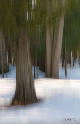
On to bigger and better things. I'd like to show you an image I worked on this week in Photoshop, tell you a little about how I did it, and introduce you to a tool you likely haven't used. I'm also looking for comments: the jury's out as to whether I like this image treatment or not. Do you? Please post a comment. Anyway here goes:


FacZen Photography Tips

The pen tool in Photoshop


There's a tool in Photoshop that lets you make the cleanest, most precise selections possible of smooth geometrically shaped objects. It's the PEN tool, and it works with Bézier Curves.


Greek, right? Well not really. Pierre Bézier was a French engineer who used them to design automobile bodies.They were actually first developed in 1959 by a fellow by the name of Paul de Casteljau (Wikipedia, where you can learn more than you ever wanted to know)

I'm not going to try to give a lesson in higher mathematics. What you have to do is try it and figure out how it works for you. Bear in mind that the [alt] and the [ctrl] keys ([cmd] and [option] on a MAC) will modify how the tool works.


What you do is to select the pen tool, then draw a path around the object you want to select. You do this by adding points as you go around the object. Put one wherever the curve changes direction or changes shape. Now go back and with the alt key, you can move the points to exactly where you want them. Now click a point with the "convert point tool" which is nested under the pen. It changes it from a linear point to a Bezier one. You will be able to drag two handles away from the point -- and the distance and the direction that you drag them changes the shape of the line joining the points. Try it. It's easier to do than to say.


The path is very precise. And because it's a vector, it's perfectly smooth. Blow your picture up and get to work until the line matches the area you wanted to select! Here:


(the lines are faint. Click on the image to blow it up to see it better). The path doesn't exactly match the curve. But watch what happens when you drag the handles:


Voila! Perfect selections. Here's another view of a different area of the curve:


OK. When you're done, you've created a PATH, not a selection. Now you have to save it as a selection and I'll leave it to you to figure out how to do that (hint: there's a "Paths" palette, just like the "History" palette or the "Layers" palette"). Now you can do whatever you want with that selection -- put it on its own layer, fill it, stroke it, warp it, whatever you want!

So here's an image I created using this technique.


What I was trying to do was to enhance this image of a steering wheel and dashboard. I wanted to add some 'artsy' effects to the dashboard and frame it with the texture and curve of the wheel. So I used the pen tool to select the dashboard and put it on its own layer. I converted the original to a duotone and added some lighting effects to bring up the texture. Then I went to the dashboard layer, added some strokes and stuff in "Filters", played with the blending modes and gave it a green glow.


So take a minute to comment: do you like the image? Hate it? Want to pay $1000 for a signed original?

The bottom line: There's a selection tool in Photoshop that allows you to make VERY precise selections. It's a little tough to use at first, but it's worth it!

Tuesday, April 07, 2009

The Creative Juices are starting to flow

More input from the world of, "gee it's boring out there". I'm not feeling really creative with the camera in hand, but when I sit down to Photoshop, it gets better.

There's no colour out there. Everything is muted greens and browns, and, especially after the early April snowfall we had, white. Blah. So I did two things: found colour where it was and punched it up in Photoshop, or got rid of it to create monochrome images. I also tried to focus on shapes and motion. Anyway, here's a couple of my efforts:


This image was really of two dull, lifeless, faded canoes. I selectively increased the saturation, painted a reflection of the sky in the open water, and cropped it tightly to emphasize the curves.

Today, as I was driving back to Toronto, I noticed a stark, lonely laneway in a pine forest by the roadside. I made a U-turn, parked and tried unsuccessfully to capture the essence of the scene. Sometimes I see something in a scene but can't figure out how to capture it in camera. I took this shot to record what was there:


Then I shot a few exposures with camera motion (I seem to be stuck temporarily in that genre!). When I got it home and started playing with it in Photoshop, I cropped it and decided that even that effect was boring, so I looked for some filters to add an interesting effect and came up with this result using the reticulation filter.


There's still art out there at this blah time of the year!

Sunday, April 05, 2009

Model Releases

I posted to the blog this morning, and forgot to tell you one thing.

Remember the painting I posted a couple of posts ago? The one of the "Mountain Man"? Scroll down to see it. There's a story to be told.

Iris and I were at the High Falls Gorge centre in upstate New York last summer. I took a bunch of nature images during the day and when we were done, and wandered back into the building itself around lunch time, I saw this amazing man there. Turns out he works there: his name is George, and his job involved working outdoors, maintaining the natural and beautiful surroundings (sounds like an oxymoron: how can you maintain it and still call it "natural"? I'll leave that topic for another day).

Anyway, I was taken with George's appearance, especially the beard. I asked him if it was all right if I took his picture, and he agreed, and posed for me in the light from a nearby window. I liked the composition so much, I forgot to take more than one exposure!

So I did some photoshop work on the shot, and then, during and after Hilarie's course, I decided to try to paint it. I loved it. I got to thinking that George might like it too, so I tracked down the High Falls Gorge website and sent them an email, asking if they could put me in touch with him. I admit that I had an ulterior motive as well; I didn't have a model release from him, and thought I'd try to get one.

To make a long story short (how come whenever anyone says that, it's too late?), they wrote me back: George has passed away. He died of cancer a few months ago. They loved him and are dedicating a cabin to his memory, and I'm sending a print of the painted image for their dedication.

So: model releases. If I use this painting for my own purposes, in fact even if I sell the image as art, or if it appears in a dedication to George somewhere, I wouldn't have a problem with copyright or issues around using his image. But what if a beer company saw the picture and decided that it would make a fantastic background to a print ad, or if it was used by a Hollywood producer in a promo for a new film called "Mountain Man"? Or if I submitted it to a stock photo agency? And what if George (before I knew he was dead) or one of his relatives saw the picture and decided to sue me? You never know what might happen with one of your images.

Get the subject, or if it's a kid, his/her guardian, to sign a model release. You can Google the phrase and find some suitable wording, or drop me a note for a copy of the form I use. This is like insurance, folks. You should do it...

Spiffing up boring scenics

I was debating which of two photographic techniques I wanted to talk about today. I haven't been doing much photography over the past few weeks because I've been busy with work and other stuff, but there were a couple of learning experiences I wanted to share.

I decided that a discussion on spiffing up some forest shots in the boring and ugly early spring would be good to do first since it might inspire a few of you to go out and try it, instead of sitting at home bemoaning the fact that the world isn't pretty out there right now.

The other topic worth writing about is a foray into HDR, because the results can be fascinating and the technique is not entirely intuitive. I teased you a couple of weeks ago with an unfinished HDR image, I can document how I did it, but I'll save it for next time.

Before I get into it, I had occasion to shoot the Group photo for the Humber Motorcycle Instructor cadre a couple of weekends ago. I was looking forward to it because I have the new D300 and last year's shot, with the D70 was excellent. I looked forward to surpassing it. I was a little disappointed. Last year's was better. Somehow I managed the perfect exposure last year (I don't mean in terms of f/stop, etc -- I mean the ease of manipulation of the RAW file, the resulting super sharp image). Odd, because I used the same lens, the same camera location. It just showed me that you don't need 12 megapixels to do a sharp 18" wide print. Anyway, here's this year's shot:


As in previous years, I learned that you have to take several exposures when you're doing a group shot. Invariably, someone will have their eyes closed or a funny expression on their face, so you have to have a backup photo that you can clone a face from, etc.

I put some effort into arranging the people this year, according to height. It worked, but I think I'll do something different next time because the group is too big, the photo too wide. I had to clone in all kinds of vegetation around the sides. I'm thinking about shooting from higher overhead, getting people into a more square grouping.

OK: let's get out in the forest!


FacZen Photography Tips

A silk purse from a sow's ear!


You know that expression, right? In this case, I had the camera out with me and the whole world was just shades of mud, with a sprinkling of snow. So I tried something different, something that I mentioned before: I tried moving the camera during the exposure.


Here are a few images I took over the past few days:


Early Spring 2


Early Spring Forest Giant

Still Frozen


On the Lake

So what do these pictures have in common? Lots of obvious things, but there's one point that really stands out in my mind: No Photoshop!* They aren't even cropped! They are exactly what came out of the camera!

All of the effects that you see here were created by moving the camera during the exposure.

* OK, not quite. You have to know me better than that! All I did was to open them in Camera Raw, tweak the exposures slightly, REDUCE the clarity to make them softer and increased the vibrance, a minor curves adjustment to the dark tones, then opened them in Photoshop, straightened a couple of them up slightly, added a new layer and stamped my signature and date on, applied a bevel/emboss to the signature layer and reduced its opacity, saved them, flattened them, then saved them again as jpegs. Like I said, no Photoshop!

So let's get physical. What do you have to do to capture these kinds of images? There are two main things that effect the kind of results you will get (apart from the obvious, making sure the exposure is right, the composition and focusing on the right spot). They are: shutter speed, and how you move the camera.

Of course you know I'm going to tell you to experiment. Digital film is cheap and you might be amazed at the different feeling you get with different techniques, but after some playing around, I decided that for me, an exposure around 1/15 second was the best. Slower than that and you get too much blur and it's hard to control; faster and the effect is too harsh if you can see it at all. I also discovered that you have to move the camera parallel to the direction of the trees. In other words, up and down. But look at the last image. I moved the acmera at about a 30 degree angle for this one. Different effect!

So I set the camera so that I would get a good exposure at that speed (some were shot at a very low ISO and some with a very small opening like f/22). Then I focused on the the main object in the picture and as I released the shutter, I swung the camera upwards.

Although the rules of composition still apply (rule of thirds, interesting foreground/midground/background, etc), they become less critical because the motion, the "painterly effect" adds an interest of its own.

So pictures which would be exceedingly boring, in fact downright ugly what with all that mud and muted colour, become interesting. For what it's worth, I had a couple of these printed as 18x12 images and they're out being framed even as we speak!