Friday, November 21, 2014

Am I one-dimensional?


today you get some "sporadic musings" to start things off. Just trying to change things up from time to time.

...I hope not. At least I'm trying not to be. Yes, my first passion is photography, but there are other things in life. Something missing is people and I'm trying to correct that, but I do have others: writing, teaching, music, the outdoors...

I love music. If I could come back as anything in another life it would be as a musician. I envy people who can express their emotions so, well, blatantly. When was the last time you looked at a photo or a painting and were moved almost to the point of tears? Or with joy? So all of that said, I know that I can't play any instrument like I want to (my keyboard is sitting to my left as I write this, a guitar leaning against the wall and a handful of harps (harmonicas) lying on top of the keyboard. All unused for months now). But I can certainly listen to others play and perform.

What's driving this discourse is the fact that I attended a great concert in Haliburton last Saturday, by Harry Manx (and Steve Marriner). Both terrific musicians, first one in a long time. I didn't bring my camera in, although I could have – I decided I wanted to enjoy experiencing the music instead of trying to photograph it. I gave in and shot a couple of iPhone shots, that's all.


Too many links... go to YouTube and search for these guys. Their music is off the wall and not what you're likely used to but you might be impressed by the skill and emotion with which they play. PS, I never thought I'd be impressed by someone who plays a Sitar (or sitar-like instrument like the mohan veena) and clearly is influenced by Indian music (OK, George Harrison...). He did drop the "Ravi Shankar" name.

As I re-read this and wonder why I wrote it anyway, the realization has set in that as I age, I've transitioned from participant to observer, and that's not a great feeling. I used to ski, hunt, fish, hike, work out, play racquetball, put 17km on my legs and knees on a weekend teaching motorcycling... I was invited on a trip to Yellowstone yesterday and have been considering Iceland. But my first thought is, "how much walking is involved"? {sigh}. I really have to do some of these before I can't any more.
Message: don't "put off until tomorrow what you can do today..."

Another Great Experience

I've been fascinated by American Sign Language for some time. I haven't learned it properly because I really don't have anyone nearby to practice with, although I know three people who are very conversant with it: my cousin Dr. Steve who is a psychologist and specializes in deaf patients, Shannon, a photographer friend from the Huntsville area who is hearing impaired and in fact teaches ASL, and my friend Ilana who works with deaf kids at the York Region School Board.

Enough intro? Ilana and I went to a new restaurant in Toronto called "Signs" where all of the wait staff are deaf. And you have to order from the menu using ASL (there are 'cheat sheets' on the menu and the table!). The food is good, prices are Toronto-competitive, and the atmosphere is outstanding! I highly recommend the place.


I was going to photoshop this to make me taller and slimmer and not so stupid looking, but hey, 'I yam what I yam'. Ilana, of course, doesn't need any photoshopping! 

By the way, when we first walked in, the maƮtresse-d' (did I get that right?) specifically said it's OK to take pictures. In hindsight, I should have taken some shots of our waitress Chandri (her 'sign name' is "Candy". You'll understand what that means if you get into ASL), while she was talking with us. Signing with us. I will next time, because I'm definitely going back. Watch the little video on the Signs site.

What's fascinating about ASL is it isn't just making signs with your hands, speaking in ASL is like acting. You need to add body language and facial expressions. People who speak it well are soooo fast! It's hard to read them! But our waitress and the other staff at Signs know that, and are really helpful!

By the way, as long as I'm rambling on about this, did you know that there's less and less need for signing today? Two reasons that come to mind: a large percentage of profoundly deaf people can regain some hearing through cochlear implants today; Ilana tells me there's almost no need for signing in the public school system any more; and electronics, like iPads and the like, make communicating much easier than it used to be. See? You learned some trivia today!


I DID photoshop this one. Slim, eh? Too bad it's not that easy in real life! 

PS If you Google "ASL" or "American Sign Language", there's lots of links to learning the basics.

Speaking of iPads...

I was, right? OK, I mentioned them... I can't use my old iPad 1 as much any more. Somebody mentioned recently that Apple has built obsolescence into the iPad (and iPhone) products. They have, haven't they? Consider that I can't upgrade the I/OS in the old iPad beyond version 5. Then apps come along with updates that I can't install or worse, that I can install but no longer work. I haven't figured it out yet, but iBooks, which I used to use to read a library of books and pdf's on the iPad, doesn't want to work any more. Hell, I can't even play Scrabble. I think Apple wants me to buy a new one... anyone else have this issue?

Colour Space

For my photographer and Photoshopping friends (what photographer doesn't do post processing today?), the issue of colour space is important. Bottom line, what you see on your screen will likely not match what you get when you print; and what you see on the internet (especially FaceBook!) doesn't look like what you're seeing in Photoshop or Lightroom. It's not a simple topic.

When you're editing, you're likely using a "colour space" which is bigger than what the printer or monitor can handle. For example, you might have something fluorescent orange which won't look that way when you print it, but you want to edit it in such a way that you can see all the detail, all the nuances of colour in the program, onscreen. But as I said, the minute you want to post that image online or print it, you have to convert it to the colour space those media can handle. And that's not so simple either! For example, do you want that range of fluorescent orange colours to look like the brightest orange you can print, or do you want to "map" them down into the colour space so you can still pick up details?

A good example was that business card I showed you last week: the printing press uses cyan, magenta, yellow and black inks to create the colours, your monitor uses red-green-blue*. They're obviously going to look different and in this case, I had a greenish tinge. Both Lightroom and Photoshop have the ability to simulate what the image is going to look like in a different colour space – PS more that LR – and it's called "soft proofing". Here's an example


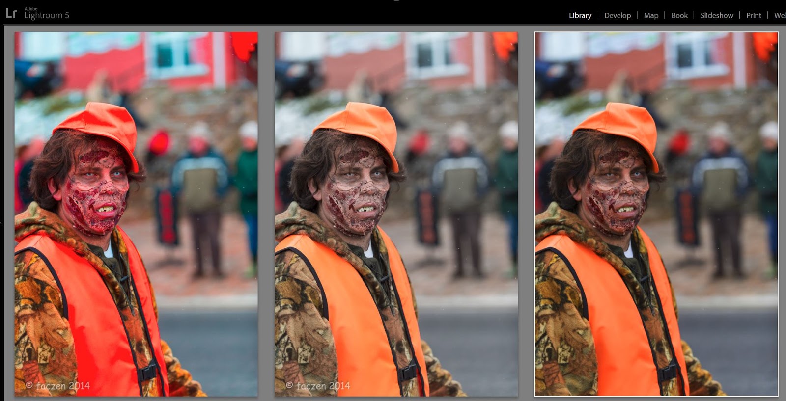
The picture on the right is what the image looked like when I finished editing it (just the colour, etc. I haven't edited the picture itself, so don't criticize it!). But when I saved it for FaceBook it looked like the middle one. In order to make it look good in sRGB (for online or printing) I had to change it in Lightroom to look like the picture at left.

* Actually whenever you put ink on paper, you're dealing with reflective colours and when you look at images on a monitor, it's transmissive colours. So all printers work on the CMYK principle. When you send an image to your inkjet printer, you send an sRGB image and the printer translates that into how much Cyan, Magenta, Yellow and Black to put on the paper. Some printers have more ink colours (the Epson 7900 has 11 of them, if I recall correctly) in order to reproduce nuances better. Some newer ones can work in other colour spaces. I don't know any printer that can reproduce fluorescent orange the same way a monitor can.

So if you've ever sent a picture out for printing or posted it online and you were disappointed with the colour, this might be the reason why.

Don't get me started on the need to calibrate your monitor if you've got any hope that what you see is what you're going to get! What if your monitor was too red? You'd adjust a picture onscreen until it looks right but look at it on someone else's monitor or in print? If you calibrate you have a chance that they'll be the same.

So much for my lecturing for today. It's one of the things I talk about in my Photoshop and Lightroom workshops. Want to learn more? It's the right time of year, the weather outside's getting frightening! Read about it at www.photography.to and sign up for a course!

What's Art?

There's a discussion going on on Facebook about whether using Topaz Impression is cheating, pretending to be an artist. There are arguments going back and forth about how the computer is not a real art medium, how only people who hold brushes and get paint on their clothes are real artists...

I'm torn. Clearly, anyone who can translate their vision into a shareable medium is an artist (I consider ALL musicians to be artists, see above). Regardless of how you do it (Warhol and his Apple Mac were used as an example), it's art. And there's nothing wrong with emulating someone else: otherwise the question, "who were your influences when you were starting out?" would be meaningless. COPYING someone else is a no-no, though.


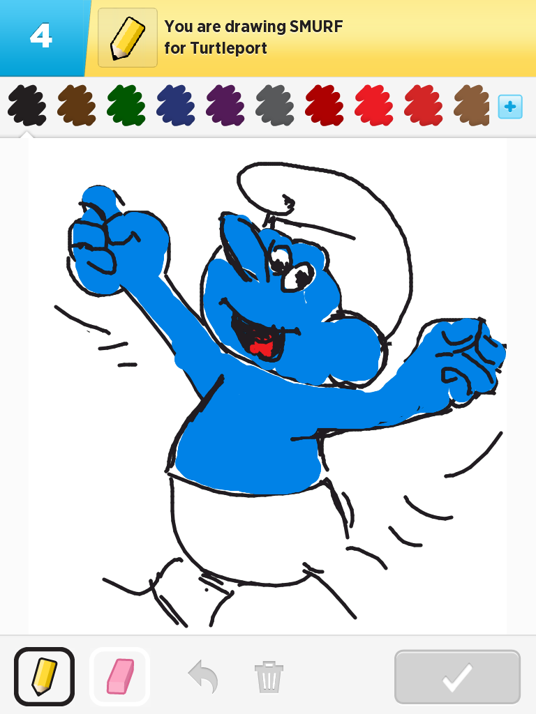
Dumb example. I created this in a game for my grandson on my iPad by bringing up an image on my computer, looking at it and then sketching with my finger on the iPad to copy it. This isn't art. It's copying someone else's art. 

But if I take one of my photos and apply brush strokes and textures to it using Topaz Impression, does it become art? Well it already was art... I'm just making it look more like how my mind saw it. Impression's presets are labelled "van Gogh", or "da Vinci", or "Cezanne" or... does that mean I'm pretending to be one of those masters? I don't think so. Since I never studied classical art, I had no idea what those masters did or what their work looked like. As I look through the presets, I find ones that I like, they could be called "X" or "Z" or "fuzzy brush strokes", doesn't matter. By the way, I'm enjoying looking at paintings and would like to know more. I need to go to Kleinburg (The McMichael Collection) again soon. The AGO is south of the 401... 

Can you create art on a computer? Without question. Look up Patrick LaMontagne. His work is amazing. Do I think the National Gallery will ever display a work done in Impression? Who knows? Who ever thought that a Campbell's soup can would be considered art?

I love Impression. It allows me to add another dimension to my images, and as I said above, it makes them look more like what my mind saw. Is it art? Youbetcha.


I reworked this old image in Impression, using the Edward Hopper I preset as a starting point. Probably not something I would hang on my wall, but fun...

Here's the thing. Pictures with minimal editing in them now look flat and lifeless to me. I have to get out of that mindset.

So now some pictures...


If you want to practice shooting birds in flight, go to the dump! Just as I learned from shotgun hunting, when you have a whole flock, you have to pick one bird to focus on (or use a small aperture to get huge depth of field). In this case I got lucky, I had the wrong focus point selected!


There's a plug-in for Lightroom that shows you which focus points were used when you shot the image. 


Sometimes the bird is just standing there, posing for you! My camera is always set to AF-C (continuous tracking) and back-button focusing, so I'm always ready, whether the subject is moving or not.  


Nailed it! But I did shoot about 50 images... I liked this one the best. 

Shooting pictures in the winter is challenging. For the above shots, I set the exposure compensation to about +1ev because I wanted white, not grey snow. Read about it and other winter tips in my 56 page eBook, "Winter Wonderland, a guide to taking better pictures" available for FREE to subscribers to this blog (click the Newsletter link at the top, or here). If you're already a subscriber, you'll get an email with the link to the free eBook. If you don't want to subscribe, you can get the eBook here for $2.


Here's my picture of the day. I went out for a walk and saw the grass poking up through the new snowfall, and the boat mostly buried in fresh snow. It was coming up to sunset, so the shadows were interesting and as soon as I spotted this scene I knew basically what I wanted to do with it. So I shot it with the idea that I was going to process it with brush strokes. I chose the "Georgia O'Keefe" preset in Topaz Impression (there were about 8 presets that I liked for this!) and didn't change it much. This is definitely going on my list of images to print. 

Just a reminder that this time of year you might want to have some Holiday greeting cards printed up with your own images on them, or mine if you prefer. I can help, very inexpensively fro excellent quality. And think about giving gifts of art, it's perfect for those who are really hard to buy for! I have a great selection of images on my SmugMug site (just working on updating it today), on RedBubble (check out their pillows, smartphone and tablet cases and skins and other stuff! Some great gift ideas there!) and on Fine Art America, all at very reasonable prices. Check them out or send me an email and let's talk!

— 30 —

Sunday, November 09, 2014

I live in the "705"!

New Phone Number!

I'm a procrastinator. I've been living up here in the highlands for 7 years now, you'd think I'd have a local phone number by now! My neighbours have complained that they have to call long distance to reach me and I have a certain lack of credibility because I don't have a local number (for the record, if you're grandparents weren't born here, you're not considered a 'local' anyway!). I needed to keep my business number (for the First Aid business). Up to now, that's been a Bell "SNR" number which was permanently forwarded to my cellphone.


Like many other people, I don't have an actual home phone. I live on my cellphone. There are a few disadvantages but I can live with them. Because my cellphone plan has unlimited calling, I decided to make the number known. I don't really want to type it here, so look at the business card in the picture below.


The challenge was to keep the Toronto (416) number so business contacts and people in Toronto without long distance plans could still call me toll-free, and yet have a local (705) number for up here where I live. I accomplished that by getting a new cellphone (actually, I didn't get a phone, just a SIM-card) and permanently forwarding it to the (705) number. It came with an almost unlimited long distance package. Now you can call me at either number. 


The ONLY thing I had to give up was the ability to receive faxes. The one or two people every year who send me a legitimate fax will eventually learn that they have to join the 21st century and go with email.


New Business Cards


With my change in phone number, I needed new business cards. 


Front and back (or back and front!) of my new business cards. The bottom image has a green cast to it on my screen, which shows up here but not on the original file. It could be because of changing colour spaces, from CMYK for print to ProPhoto RGB in Lightroom to sRGB when making the images for here... we'll see what the actual printed product looks like. (update: it's somewhat in-between. If I were reprinting, I'd warm it up a little).

The other thing that's inaccurate is that the actual printed cards will be slightly trimmed from what you see here. These are 3.627 x 2.127" and they'll be trimmed to the standard 3.5 x 2" when made.

I have an outstanding wholesale printing supplier who specializes in business cards. Because they gets hundreds of orders per day and can standardize inks and paper (they put all the cards on one big sheet, run it through a top end large format printing press) their prices and quality are UNBELIEVABLE.

I ordered 500 business cards, printed in full colour on both sides, on 14-point bright white glossy stock, with an aqueous coating that provides excellent rub and scuff resistance. My cost? Around $20. That's right, I said $20.


If you want cards, let me know (delivery US and Canada). You can approach this two ways: (1) you do all the artwork. I'll send you a template, just fit everything inside the lines, produce a PDF file (press quality, in CMYK: you can do that in Photoshop easily) and send them to me via dropbox or (2) send me the pictures you want to use and the text, I'll do the layout for you. If I do the layout, I have to charge you for my time, of course. I'm reasonable but not free...


Or you could use one or more of my images. There's a selection on Smugmug, here. You could also use virtually any image you've seen on my blog. Get in touch with me by email and I'll send you details...

AND they make greeting cards (folded to 5x7 with an envelope!) and a hundred other products.
Think Xmas...

Just want to go on record...


I HATE Leukemia. I just attended a funeral for someone who passed away this week, far too young. His name was Howie Mandel (not the one most of you are thinking of). He was, admittedly, more of an acquaintance than a close friend but he was close with several people whom I care about and his death had a big impact on them and therefore, me.


Leukemia or lymphoma have taken too many, too soon. My first girlfriend died of it in her 20's. My dear friend Fran was taken a couple of years ago. 


Just feeling sad and hope writing about it is somehow cathartic. 


Winter is on its way

I'm pretty well ready: we still have to address the sump pump line problem, one last small repair on the ATV but the plow is already mounted. The roof is done, at least the critical part, firewood is cut and stacked, chimney re-cemented, summer shorts and bathing suits stored, winter boots ready. Do I hate winter? Not really. I don't love it like I did up to a few years ago but I'm actually looking forward to crisp white snow underfoot.


The last vestiges of fall are slowly giving way.


This stubborn shrub is next to my fence and it refuses to drop its leaves. I think they will eventually, they're holding on by a thread, but virtually everything else is down now.

Impression is such a great program because it turns a mundane photo into a piece of art. Don't get me wrong: the picture has to be properly exposed and composed and focused... but it can do wonders with an ordinary picture of a leaf.


The forest looks like this, sun filtering between bare tree trunks, snowflakes gently falling on the still-wet ground. 

But I don't like this time of year. There are two times I don't like – early spring and late fall. The world is damp and dull and wet and chilly and grey and ugly. When I used to be a hunter, I looked forward to November. Spring was a lot warmer than winter, you look forward to summer. But November? As I type this, I look out on a couple of inches of soggy, wet snow. My hands are chilly, although it's warm enough in the house. I'll go lay a fire in the fireplace and it'll be better in here, but it's ugly outside.


On the other hand, there are days... like yesterday, as I drove into Toronto, the air was crystal clear and the light was gorgeous. I was under some time pressure but I couldn't resist stopping for a couple of pictures, and the one here is my new Blog header as of today.


I spent an hour painting this image, tweaking this and that, then I saved it and by chance looked at it beside the original, unedited image right out of the camera. Yep, that's the one I used! OK, well it's a 5-exposure HDR,  

Sometimes an image just doesn't want to look like my mind wants it to. That's the case with this one. I want the trees to be silhouetted against a dark sky but I can't seem to make it happen. HDR's like the header above look a lot cheerier, somehow. In this bottom image, which is just a single virtually unedited frame, everything is wrong technically, the histogram is way off, there aren't any whites... but it's approaching the mood that I want. I'll keep at it. 

Two minutes later, I pulled over for another shot. 


I can't explain. There was something about the light... This was the original, more or less. It's another HDR, of course.


And this is my final version of this image. I removed the gate. I leveled the combine (or whatever it's called). Both of those things were "fussy" work. I used Topaz Adjust to add colour and contrast to the sky. I thought I was done until I opened Impression to play with it. There are two layers of Impression used here, one for the sky and one for the foreground. Click to blow it up so you can see the brush strokes.
— 30 —

Sunday, November 02, 2014

Be Afraid. Be Very Afraid.

They made Topaz Impression even better!

Topaz released version 1.1 of Impression today! [update: version 1.1.1 came out a week later with some more improvements] The big problem is "too many presets"! There are so many you could spend an hour deciding which one you like best!


I was just playing with this one. It's amazing how saturated the world gets when you shoot in the rain, at dusk. Since I can never leave well enough alone, it's a 5-shot HDR, enhanced with Topaz Impression, Georgia O'Keefe II preset, dialed back to 66% and Edge and Detail Enhanced in Topaz Simplify.  

The picture above is a bit of mystery to me. It was really loved on Social Media, in fact the "Topaz Impression" group selected it for their masthead. I have to be honest, I don't love it that much. I get that it emulates Georgia O'Keefe's brush style and colour choices, but I initially found it too strong. Interestingly, I shot it from virtually the same spot as another image a couple of years ago (different, it was about the foreground vegetation). At that time, I was about to discard it when Rosa said it was absolutely my best work, and of all my images, she chose that one to have a print made for herself. It just shows that everyone's taste is different.


Honestly, I liked this picture much better, but I didn't get a lot of reaction to it. To me, this is a gallery-ready image. It's a rework of an older image, using the Impasto preset in Impression. I took this picture because the bike colour matched the wall colour and as I captioned, I wonder which came first. 


Here's a pencil sketch of my house taken at the same time but enhanced with a totally different preset in Impression. I started with something called Cavedweller IV but did a lot of custom modification from there. 

One more:


Once again, I used Impression and selected the "Sketch III preset. I won't bore you with the variations I made, the 5-shot HDR,  the second layer with a different brush rotation, the added subtle lighting effects in Photoshop... oh, too late, I already did! This needs to be viewed larger, so click on it.

Back story on this image: Friday night was the first sprinkling of snow up in the Highlands and as I was driving to Haliburton for the event below, I spotted this stand of trees frosted with snow. I ventured into the woods and came across this cabin. I would have preferred a shot where the cabin was much smaller, in other words, with a wide angle lens; but I had the wrong one with me and this was the best I could do. There was a large run of split firewood where I was standing so I couldn't get further back. Just guessing: the owner of this property has logged it, the stand of trees is clearly second growth. Maybe the cabin was built to house the loggers. It was clearly disused and yet there were several bush cords of split firewood there, that shed in the foreground was only a small part of it.

If you're not yet a Topaz junkie, or just haven't tried them yet, get thee to this link or click the box at right to try/buy any of their products. And if you enter "faczen" in the checkout box, you'll get a 15% discount.

Zombie Walk!

Linda send me some pictures that she had taken when she and Cheryl went to the Toronto Zombie Walk a few days ago. They were really great, and intriguing! (Here's the link to her online gallery). Then I heard on the radio that they were going to have one on November 1st in Haliburton, so I went! I hoped to match the quality of Linda's images but I don't think I succeeded. However, here are a few samples. It was a fun afternoon!


Gord Kidd under that makeup. Apparently I'm supposed to know who he is but I've only lived here 7 years, so what do I know? 


A far more subtle "undead" person.  


My favourite shot (so far!). I cropped this out of a larger image, too bad I didn't get tack-sharp focus on her eyes. Remember, you can blow up any image by clicking on it. She was really into the role, never saw her crack a smile, even when she won an award for her costume/makeup.  


OK, maybe this is my favourite shot... for the photographers/Photoshoppers out there, I had my Speedlight on the camera with the Gary Fong Diffuser and compensation to -1ev. I wanted to separate the subjects from the background, but in the end, the background you're looking at is not what was there. I created a black background then added in some Flypaper textures. It was still too prominent so I used Impression/Impasto to change it. Some extra sharpening and a little retouching on the Zombie Girls.

By the way, these weren't the only people there who had put in contact lenses to change their eyes. Some people took this event quite seriously!


Retouching hint

Admittedly, I'm no professional retoucher (imagine trying to retouch that picture above!). But I get that you can overdo things (who, me? LOL), plastic skin is not a good look. My ex-GF asked for my help with a picture for her website and because I'm a nice guy, I spent over an hour on it. Honestly, I could have left it after 30 minutes, but I got carried away and tried to do it just right. Here's the before and after:


Disclaimer: not my photo. Taken in a Sears photo concession. Not 'that' bad, but lighting was too hard, pose was not flattering, artifacts in the background, focus not bang on... click to enlarge.
So what she asked me for was to take down the reflections, and a small enhancement on her teeth. In addition, I changed the perspective slightly (they had her looking up at the camera), cleaned up the fly-away hair and spotted a few blemishes, cropped it differently, used liquify on some places not in the final image and then worked on the skin, although she doesn't need it.

So what's the hint? I decided to finally try "Frequency Separation" to do the smoothing. The idea is to split the image into two layers, one containing the colour information and toning, and the other the details (pores, lines, etc). It works. It's a little tricky at first, but you have quite a bit of control.

I'm not going to give you a link to a tutorial on it, I watched a few of them before diving in: Google it. "Frequency Separation". As usual there are 704,329 pages in Google.

So what do you think? She looks pretty good for a 75 year old lady. OUCH. Stop That. I'm kidding. She's not a day over 65! You owe me one, Iris!


— 30 —