FacZen Photography Tips
Some Photoshop techniques
The purpose of this article is to walk you through the thought process and the steps I took to produce the requested image. I know that not everything I did was correct, but my intention is to show some of the things you have to think about when you're asked to do something like this, and maybe a little bit about how I achieved the results I was looking for.
Before I agreed to go ahead, I need to know if the photos were of sufficient size and quality to work with. I received the photos as email attachments. Both were .jpg's and both were large enough. It looks like they were taken with a point-and-shoot camera of some reasonable quality. On close examination, the focus was off (the wall was in focus but not the girl) and some areas were blown out by overexposure, but it wasn't too bad. 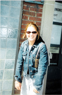
This is the original photo I received (reduced in size for this Blog)
My first question was, "what do you want to do with this picture?". I was told that he wanted it as a cover picture for the manuscript he was submitting and that he would be printing it in black and white on a standard HP Laserjet printer. He wanted the text to frame the image but I decided to make it part of the finished picture. He told me he wanted the title to be large, the subheading medium and his name to be small. Since he told me he was submitting it to a publisher, I thought it would be wise to produce a sufficiently high quality image to be printed on a press. I knew that 240dpi was generally fine for both a laser printer and a press; and I decided that 5"x7" would be a good final size. I figured he probably wouldn't be printing in colour down the road, so I was going to convert the photo to black-and-white. If he wanted colour later, I'd have to go back and redo it. Using Bridge, I opened the picture in Camera RAW. I wanted to do a few things there before taking it into Photoshop; for instance straightening it up (Bridge has a great tool for aligning an image horizontally) and doing the monochrome conversion. While I was in there, I reduced the exposure and added some recovery for some of the blown out white areas, and did a little preliminary curves work to start bringing the face out. Use the sliders when doing the black and white conversion, especially the red one for the skin tones. All right, into Photoshop (CS4). First step: ctrl-J to duplicate the background layer and ctrl-S to save a PSD file just in case. I use lots of keyboard shortcuts, so ctrl-0 (that's 'zero', not 'o') will blow it up full sized. Normally one shouldn't crop until later, but I knew what I wanted so I went ahead and did it now. I preset the crop tool to 5" x 7" x 240ppi, then I dragged on the image and moved it around and resized it until I saw what I wanted. I wanted her off-centre, looking into the image and I really hated the way she was standing with her shoulders forward and hands hanging, so I cropped the bottom. I also cut space off the top: to my regret, so I had to fiddle with it later as I'll show you. I opened up a curves adjustment layer and blew up the image so I could see the effect on her face. Then I ran the sharpening tool at a very low density (10%, I think) over her jacket, hair and face. Here's what I had at this point.
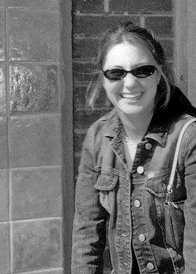
The tile and the brick wall are distracting. I needed to do something about that, and remember, I want to lay some text over this picture. I created a new duplicate layer from the background layer, then applied a Gaussian blur to it. Next came a quick and dirty technique. I activated the sharp layer, then I simply erased around the girl with a soft brush. The Wacom tablet helped, it's a lot easier to be accurate with that than with a mouse. I could have done a fancier selection, but this did the job. Now the background was in soft focus and the girl was sharp. OK, next step. I have to lay a title over the top of the picture but I didn't leave enough space above her head. Oops. Now I could start over or... I could use a new tool in CS4 -- content-aware scaling. What I did was to select everything in the picture from the top of the girl's head downward, then I dragged the top handle down using this sneaky tool. That left more room at the top without affecting the proportions of the girl. Now I simply selected the top portion and using regular scaling, I dragged it down to seamlessly mate with the rest of the picture. One more thing before I show you the next step: I wanted the text of the subtitle and author's name to stand out, so I wanted to put a graduated dark screen at the bottom. I also wanted to hide those arms that were in a funny position. So I created a gradient map adjustment layer, clicked on the mask and laid in a graduated screen. I dropped the opacity until it looked right to me.
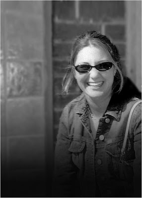
Blurred background, rescaled, and prepared for the text! The white keyline is to separate it from the black background of this Blog.
OK, now the text layers. I chose 36pt Hobo Std and grey type for the headline, and added a drop shadow to the layer. Then I used Palatino italic and regular in smaller sizes for the subheading and author.
I went back over the image and fixed a few things: a white artifact at top left, and I used the burn tool on her face to darken it a little. Done. All that was left was to save the .psd file, then flatten the image and save it as a .jpg. Here's the finished product (with some typographic changes to preserve anonymity).
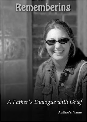
This image can be used as requested for printing on a laser printer, and if the manuscript ever gets published, it can serve as a front cover with almost no additional modification. The white keyline is to separate it from the black background of this Blog.
Sounds like a lot of work? Maybe, but everything was straightforward. The lesson is to use lots of adjustment layers so that your work is non-destructive and to save frequently as you go along. The whole thing took me about 45 minutes to do.
I hope it gave you some ideas for your next project, and some hints about what to look for and how to achieve what you have in mind. I'm obviously not the sharpest PhotoShopper around, so if I can do it, so can you!
| 


No comments:
Post a Comment