Showing posts with label Photoshop CS4. Show all posts

Sunday, December 27, 2009

It's that time of year!!

You know, when you’re tempted to buy stuff you’d like to have but you don’t really need. I actually went out on Boxing Day to see what I could find (researched online first) but bought nothing. I was looking at the iPod Touch, because of the killer “Camera Control” app that would let me remotely control my D300 via wifi. One question I didn’t find the answer to was whether I would need to install Nikon Camera Control Pro to use it: a $200 investment. If I do, then it doesn’t make sense to spend all that money for this occasional use. If not, well it would be nice to have a new music device at the same time. Still, I didn’t find any deals except for a FutureShop thing where they were throwing in a speaker dock. By the time I got there, they were sold out.

I have some time to go on my Blackberry contract: next year maybe I’ll get an iPhone to do the same thing.

I went online to Kelby Training (you know, the NAPP people) and started to order some books. There’s the Scott Kelby Digital Photography Library, a Lightroom book (now that I’m using it), a book on Digital Painting and I thought I’d finally break down and subscribe to Layers magazine. However when I tried to enter the order, it wanted a ridiculous $44 for shipping! I cancelled the order and wrote them an email. I could have them ship to my son in New York and for $10 he could mail it to me, but I don’t really want to put him to the trouble. Watch this space to see if NAPP or Kelby, actually, does the right thing here.

 I really want a new digital tablet. Specifically, the Wacom Intuos4 (Buy it here) .

I really like using the little Bamboo, but it’s a bit small and lacks some of the features I’m just starting to appreciate, so the medium sized Intuos is what I need. I’ll keep the Bamboo for portable use with the laptop but this desktop is crying out for something more precise. I’m pretty sure there are some people out there who don’t use their tablets and wouldn’t mind selling it. Drop me a note if that describes you. Otherwise, I’ll order one in a month or so.

There’s some smaller stuff too. I wouldn’t mind getting a couple more CF cards for the D300 – 4Gb fast would be nice if they’re on special. Another 1Tb backup drive as well, so I can back up my backups. Actually I would dedicate one to my photos only, now that I’m getting into Lightroom.

Then of course there’s a new car, remodeling the bathroom and some other work in the house, an ATV, trading my motorcycle for a newer dual-sport, and so on. Anyway, that’s a short list of the material things I’d like to have.

 Money and things aren’t everything (well they help…). What I really wish for is health… for me and for those I love. Because without that, the stuff I listed doesn’t mean much. That’s what I hope for all of you.

 I saved a couple of topics from the last post because it was getting too long.

 So the topics in this Blog post are:
  • The Santa Claus shoot I did with Jim & Jen Camelford
  • Some notes on the Photographic Judging Workshop I attended
  • My early experiences with Lightroom
  • A neat thing you probably didn’t know you could do in Photoshop
  • Doing screen captures
  • A cool music site.
Before we get started, here’s a little reminder:

 Is your firmware up to date?

 (For you lo-tech types, I’m NOT asking about how your diet is going!)

 I read a note on the Kelby site that made me go to the camera and check the firmware revision. Both “A” and “B” were versions 1.03. The Nikon site (the better one to go to is the US site at www.nikonusa.com) said the current version was 1.10. You should check yours. The update is easy, and free. Follow the instructions, though – there’s a warning that if you don’t do it right, your camera may have to go back to Nikon for service! I’m not sure (OK, I don’t know!) about how it works at Canon or any of the less popular brands. There’s firmware in your Point-and-Shoot as well. Best to check.

 Santa Claus shoot

 In a conversation one day with Jim Camelford, he told me that he was committed to doing a shoot at a local school, the kids with Santa. It was a fundraiser for the school and was of course pro bono. Jen would man the computer and keep track of the names. The resulting pictures would be printed and put in a card frame for each kid. Apparently there were about 300 kids to do. I volunteered to help Jim and Jen out.

 The school had their idea of what they wanted the pictures to look like. They had set up a bench with a snowman and a tree and a furry rug and… about a million props. Both Jim and I thought a tight shot of a kid with Santa would be best, but it’s whatever the customer wants, sometimes.


Santa and friend


Same shot, cropped tight.

We had thought in advance about how we would do it, so I bundled a backdrop and stands in the car and drove 3 hours through the snow to get there. Just for fun, I threw one of my studio strobes in as well, with an umbrella.

Our original intention was to use a couple of Nikon hot shoe flashes – Jim has an SB-800 and I have an SB-600 – both equipped with Gary Fong diffusers. The flashes were to be remotely triggered by the D300 in commander mode. It would have worked, but since we had the big strobe, why not use it?

 So this was our lighting setup.


The main light came from the big strobe and we used Jim’s SB-800 on (our) left to fill in and soften the shadows a bit. The SB-600 was placed further over to the right, again to kill some shadows and throw a little extra light on Santa’s face. I personally hated the backdrop but it was better than what was there before. If we could have set it up from scratch, it would have been better to move the bench forward about 6-10 feet so that the backdrop would be right out of focus. We were also challenged by the fluorescent lights overhead which were too bright to eliminate completely. The shoot worked pretty well, and in the end was nicely organized. It was a real challenge to get the kids to smile and pose less-than-stiffly for the camera! And Santa himself, who had to stand at least 6’5” had to hunch over most of the time!


Santa's cute helper. Salimah is one of the teachers who seems to have a perpetual smile and great attitude. How come we didn't have teachers like this when we were in school? Later we had coffee in the Principal's office. Again, it wasn't quite like I remembered it from so many years ago! I softened the face with the clarity slider in Lightroom, otherwise it's pretty well as shot.
Jim, of course, is a huge Lightroom user. He is very skilled at organizing and batch processing and he was the only reason this shoot worked as well as it did. All I was there for was to help provide some lighting hints, and try to get the kids to loosen up a little (“Simon says, make a funny face. Now look at Santa. Simon says, look at Santa…”. Amazing that kids today still know who Simon is!).

 I had fun. I don’t envy people who do this for a living, though. It’s hard work!

We could have done this whole shoot with the two Nikon flashes. The Gary Fong diffusers work really well and if you don’t have one, you should. As I said in a previous post, you can read the details at the Gary Fong site here, and even see a little video on how it works. Down near the bottom of the page is a chart showing which model fits your flash. You could buy it there, but for the same price, and free shipping right now, you can buy it at B&H here.

Judging Course

I attended the Canadian Association of Photographic Art (CAPA) workshop last month. It was run under the auspices of the Greater Toronto Council of Camera Clubs (GTCCC) and was offered to selected camera club members. Attending the course does not make me a certified judge, but it is a step along the way. I was interested in following that path for two reasons:
  • Learning how judges think and what they’re looking for will make me a better photographer, and
  • I’ve watched some judges in action and I think I could contribute, and help other photographers improve their skills.
Now I’m not going to reveal any secrets here (CAPA and GTCCC people, you can relax now!) but I will tell you that if you have the opportunity to attend this workshop, take it. It will make you a better photographer. It’s all about seeing stuff that you missed, and looking for that “wow” factor in your images.

 Part of the purpose of judging photos at the club level is to educate and encourage photographers. A good judge is more like Paula Abdul on American Idol than like Simon Cowell. Find something good about an image, and compliment the maker, then objectively come up with a suggestion or two to improve the image. The trick is to do that within the 20 or so seconds that you have to look at each image in a judging session.

 Here’s an example.


“Winter Road”


This isn’t fair, because it’s my own picture and I’m biased. Putting that aside, if I were judging this image I would say something like, “This is a well exposed image, with detail visible both in the white snow and the dark trees. The viewer’s eye is drawn from the dark lower left corner, along the curving road. It is sharp from front to back, however there is no defined subject and the dirty road takes away from the pristine feeling that the maker was presumably intending. This image scores a “6”.

One of the toughest challenges is to properly evaluate and score ‘artistic’ images. You have to think about what the maker is trying to convey and put aside your own likes and dislikes.

 Here are a couple more images, they are for you to score and comment on. Use the comment tab below this post and try to rate these images objectively.


"10 Below"


"Dawn Chopper"

I'm going to submit this one at the club next competition, so we'll see how you did compared with the accredited judges, OK?

If you are not now a member of a camera club, go out and join one. People all have different learning styles, but one of the best ones is to see what someone better than you – or different from you – is doing. So if you are in a club, be sure to participate in the competitions – you will learn, I guarantee it. By the way, the really best way to learn how to do something is to teach someone else. Think about it!

As far as I know, there are no clubs up here in the Minden/Haliburton area. You'd think there would be something affiliated with the Haliburton School of the Arts. I’ll keep looking, but if not, I’m going to try to start one. There are lots of artists and photographers up here.

Speaking of Lightroom… (I was, wasn’’t I?)

I’m starting to get used to it a bit. My workflow isn’t quite right and I haven’t properly organized my photos and backed them up the way I should, but I’ll do that this weekend. The beauty of the program is how you manage your files. One thing that really stands out for me is how easy it is to output images for the specific purpose intended: for instance, I used to open each picture in Photoshop to resize it for this Blog – in Lightroom I select “Export”, tell it to make .jpgs and fit them in a 1000x1000 px square, and click “OK”. All done. If I want the same images for print, I would do the same thing but just change the size and resolution parameters. And it doesn’t matter how many pictures I do at a time, it does them all at once. There are lots more good things in the program, and I’m slowly learning them.

How? Well by trying it, and emailing Jim when I’m stuck (happening less frequently now!) and by going through my back copies of Photoshop User magazine. By the way, the “Help” site is one of the few that actually works! Type a question in the search field and believe it or not, a RELEVANT document or documents are there. I’m impressed. As I said above, I’m going to acquire some Kelby Training books in the next couple of weeks to keep me on the right track.
I’ll leave you with a picture I took a couple of days ago on the way back to the house. The temperature was +1°C.


Some people have IQ’s smaller than their shoe sizes. Outside this little bay, there’s open water – the first freeze was only a couple of weeks ago and what looks like solid ice in the distance is not, it’s the beginnings and probably less than an inch or two thick. To top it off, there’s fast flowing water from a culvert coming in at the bottom left of the picture and that is open water you’re looking at. And some idiot’s snowmobile track about 6’ away from it. Darwin was right…

So did you know you could do arrowheads in Photoshop? Bet you didn't! I didn’t until I came across it while looking for something else recently. Here’s how.


Select the line tool which is nested under the shape tool in the tool palette


Click the little down arrow in the option bar at the top, and the arrowhead dialogue opens up. The values in the dialogue seem to be the default, except for the “concavity” which I increased to its maximum (50%) because I liked what it looked like.
Now drag to draw your arrow on your image. It comes in on a separate layer, so you can use layer effects like a drop shadow to make it look cool.

While I’m at it: “how”, you may ask, “did you do the screen captures?” I used a simple free utility called “Screenhunter 5.1” which is available at http://www.wisdom-soft.com/. They have a couple of more fully featured programs for a few dollars, but the free one does what I want, except for one thing: it doesn’t have multi-monitor support. It only works on your main monitor. You can set it to capture a rectangular area, the active window or the whole screen, at the press of the f6 key. It saves the file in your choice of a number of formats, I chose .jpg as a simple choice. Pretty cool! If I recall correctly, Hilarie pointed me at this one.

A cool music site

I often like to listen to music while I work. I don’t have a great CD collection, I don’t own an iPod (yet), I haven’t burned a whole lot of music tracks. The 100 or 200 tracks that I do have are getting a little old, if you know what I mean.

I used to be on a site called Pandora.com but they kicked off all non-US IP addresses. A couple of weeks ago, I came across a new site called http://www.jango.com/ which doesn’t have any obtrusive advertising, allows you to specify which artists you want to hear, you can even mark songs you like and don’t like and you’ll never hear the latter again. Every now and then, they throw in a new or budding artist, and ask you if you like or dislike him or her. When you ban a song, sometimes it pops up a box letting you see an advertiser and keeps it there for a dozen seconds before it goes away. I’d say once every hour or two. It’s clean, no viruses, etc.

My playlist is mostly jazz and blues: from Oscar Peterson to Stevie Ray Vaughan, Diana Krall and some technically good artists like the Eagles, CCR, etc. You choose what YOU want to hear. Their selection was quite limited at first, but there’s more and more stuff on there every day. Anyway, I like it – you might too!


Season’s Greetings, everyone! See you in the new year!

Wednesday, February 18, 2009

Enhancing Photographs

Someone very close to me lost his daughter to cancer a few years ago. He has prepared a manuscript for submission to a publisher and asked me if I could do something with a couple of pictures he had, one for the cover, one for the inside. I was more than happy to help out. I asked him if he minded if I wrote up my workflow in the form of a Photoshop tip on my Blog and he readily agreed, but he asked that his name not be revealed. I replaced his name and removed that of his daughter for this article.

FacZen Photography Tips


Some Photoshop techniques


The purpose of this article is to walk you through the thought process and the steps I took to produce the requested image. I know that not everything I did was correct, but my intention is to show some of the things you have to think about when you're asked to do something like this, and maybe a little bit about how I achieved the results I was looking for.

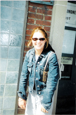
Before I agreed to go ahead, I need to know if the photos were of sufficient size and quality to work with. I received the photos as email attachments. Both were .jpg's and both were large enough. It looks like they were taken with a point-and-shoot camera of some reasonable quality. On close examination, the focus was off (the wall was in focus but not the girl) and some areas were blown out by overexposure, but it wasn't too bad.

This is the original photo I received (reduced in size for this Blog)


My first question was, "what do you want to do with this picture?". I was told that he wanted it as a cover picture for the manuscript he was submitting and that he would be printing it in black and white on a standard HP Laserjet printer. He wanted the text to frame the image but I decided to make it part of the finished picture. He told me he wanted the title to be large, the subheading medium and his name to be small.

Since he told me he was submitting it to a publisher, I thought it would be wise to produce a sufficiently high quality image to be printed on a press. I knew that 240dpi was generally fine for both a laser printer and a press; and I decided that 5"x7" would be a good final size. I figured he probably wouldn't be printing in colour down the road, so I was going to convert the photo to black-and-white. If he wanted colour later, I'd have to go back and redo it.

Using Bridge, I opened the picture in Camera RAW. I wanted to do a few things there before taking it into Photoshop; for instance straightening it up (Bridge has a great tool for aligning an image horizontally) and doing the monochrome conversion. While I was in there, I reduced the exposure and added some recovery for some of the blown out white areas, and did a little preliminary curves work to start bringing the face out. Use the sliders when doing the black and white conversion, especially the red one for the skin tones.

All right, into Photoshop (CS4). First step: ctrl-J to duplicate the background layer and ctrl-S to save a PSD file just in case. I use lots of keyboard shortcuts, so ctrl-0 (that's 'zero', not 'o') will blow it up full sized. Normally one shouldn't crop until later, but I knew what I wanted so I went ahead and did it now. I preset the crop tool to 5" x 7" x 240ppi, then I dragged on the image and moved it around and resized it until I saw what I wanted. I wanted her off-centre, looking into the image and I really hated the way she was standing with her shoulders forward and hands hanging, so I cropped the bottom. I also cut space off the top: to my regret, so I had to fiddle with it later as I'll show you.

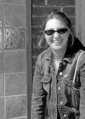
I opened up a curves adjustment layer and blew up the image so I could see the effect on her face. Then I ran the sharpening tool at a very low density (10%, I think) over her jacket, hair and face. Here's what I had at this point.


The tile and the brick wall are distracting. I needed to do something about that, and remember, I want to lay some text over this picture. I created a new duplicate layer from the background layer, then applied a Gaussian blur to it. Next came a quick and dirty technique. I activated the sharp layer, then I simply erased around the girl with a soft brush. The Wacom tablet helped, it's a lot easier to be accurate with that than with a mouse. I could have done a fancier selection, but this did the job. Now the background was in soft focus and the girl was sharp.

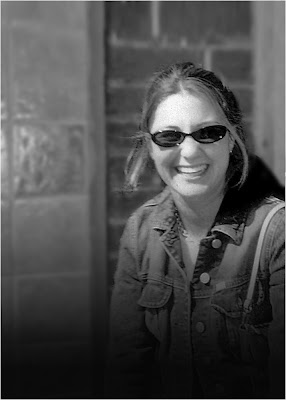
OK, next step. I have to lay a title over the top of the picture but I didn't leave enough space above her head. Oops. Now I could start over or... I could use a new tool in CS4 -- content-aware scaling. What I did was to select everything in the picture from the top of the girl's head downward, then I dragged the top handle down using this sneaky tool. That left more room at the top without affecting the proportions of the girl. Now I simply selected the top portion and using regular scaling, I dragged it down to seamlessly mate with the rest of the picture.

One more thing before I show you the next step: I wanted the text of the subtitle and author's name to stand out, so I wanted to put a graduated dark screen at the bottom. I also wanted to hide those arms that were in a funny position. So I created a gradient map adjustment layer, clicked on the mask and laid in a graduated screen. I dropped the opacity until it looked right to me.


Blurred background, rescaled, and prepared for the text! The white keyline is to separate it from the black background of this Blog.


OK, now the text layers. I chose 36pt Hobo Std and grey type for the headline, and added a drop shadow to the layer. Then I used Palatino italic and regular in smaller sizes for the subheading and author.

I went back over the image and fixed a few things: a white artifact at top left, and I used the burn tool on her face to darken it a little. Done. All that was left was to save the .psd file, then flatten the image and save it as a .jpg. Here's the finished product (with some typographic changes to preserve anonymity).


This image can be used as requested for printing on a laser printer, and if the manuscript ever gets published, it can serve as a front cover with almost no additional modification. The white keyline is to separate it from the black background of this Blog.


Sounds like a lot of work? Maybe, but everything was straightforward. The lesson is to use lots of adjustment layers so that your work is non-destructive and to save frequently as you go along. The whole thing took me about 45 minutes to do.

I hope it gave you some ideas for your next project, and some hints about what to look for and how to achieve what you have in mind. I'm obviously not the sharpest PhotoShopper around, so if I can do it, so can you!


We're talking about doing a couple of Photoshop courses in Toronto and maybe up in the Haliburton Highlands (the latter coupled with a photo workshop). Both basic and intermediate level. I'm not the principal instructor, we're talking with a professional trainer, but maybe I can help a bit. If you're interested in participating, in sharpening your skills or learning basic PhotoShop, drop me a line and let's talk!

Tuesday, October 07, 2008

New PhotoShop

If you're in the digital photo world, you know that Adobe has announced PhotoShop CS4. This just after I upgraded to CS3, of course.

There are some interesting new features in it, but not enough to make me run out and plunk down my money anytime soon. I got a glossy bonus issue of Photoshop User magazine (if you're not a NAPP member, you should be) that described all the new goodies in CS4. Most of them are 'way too high end for me -- doing videos and animations and 3D and small stuff like making the dodging and burning tools easier to use, a new adjustment panel and better layers and vector masking. All beyond my needs.

There were a couple of neat things in it, though -- especially that "content aware scaling function". Now here's a picture that could have used that new function perfectly:


What's wrong with this image is the position of the firefighter (it's not as if I could have told him to move...). If he had been much closer to the burning car it would have been a killer image. The new function in CS4 would have allowed me to seamlessly move him closer by cutting out the dead space in between. Of course journalistic ethics would not allow that anyway, but it would have been a much better photo.

The Toronto Star photo editor liked the following picture, by the way, but they didn't buy it because they said the smoke would not have rendered well on newsprint and besides, there was a plane crash that day and they didn't have space. I named the picture, "FireBug". It won an "Honourable Mention" in the annual Greater Toronto Council of Camera Clubs (GTCCC) competition that year.


There are some improvements in Camera Raw (version 5 ships with CS4), most notably some tools that work on selective parts of the image unlike the current RAW programs that will only work on the whole file. So you could darken a sky, for instance, without touching the foreground. Now you have to do it in PhotoShop instead of in Camera Raw. OK, useful to improve workflow, but not that essential unless you're processing lots of images.

Anyway, that's my take on it. It's not worth it to me to upgrade at this time. Perhaps if I learn about some other functions and get much better at using PS, it might be.