Tuesday, October 28, 2008
Speaking of Rocks
It's just text from back then and while it's interesting reading (I'm biased), pictures would make it better. Especially since the purpose of the trip was to take pictures.
So I'm going to give you a link to the slideshow I produced after the trip. It was created using Photodex ProShow Gold, and in order to see it, you need to run the viewer which is easy to do: just say "yes" when it asks you if you're sure you want to run the program. When it starts, just click on the puffin's nose to run the slideshow. Be sure to have your speakers on -- I hope you'll like the music too.
One thing: this was the first slideshow I did with that software and I wanted to see all the cool transitions, so they're all different! Normally I'd use only 2 or 3 of them.
Here's the link! (Click the photo)
Enjoy!
Sunday, October 26, 2008
Hallowe'en is coming!
Now there was something happening here. Kate was looking at her camera and the world gave a shake. Some presence was there. It seemed to emanate from a gravestone:
So I turned around and noticed a strange light emanating from the ground at the left, illuminating a gravestone. I took a picture of it and then, when I opened it on the computer later, I found this on the image:
Is that Suzannah? Is it exactly 100 years since she died?
Then there are these photos, of people who normally don't look like this...
PS: Darlene said I could use the picture here. She said "have fun with it." Iris doesn't know I put hers up here but she's a good sport.
Wednesday, October 22, 2008
Horizon Straightening part II
Tuesday, October 21, 2008
Here it comes again!
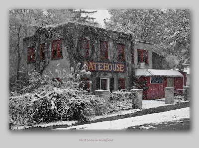
So how did I create this image, you may ask? If you didn't ask, that's OK, I'm going to tell you anyway. I'm putting on my "instructor" hat.
First thing I did was to recognize what (I think) is a good photo opportunity. I drove past it, thought about it, turned around and grabbed the camera. Braving the snow and sleet, and the trucks going by threatening to inundate me with wet slush, I chose my viewpoint and took the exposure. Before I did, I made sure that I selected 200 ISO, and I spot-metered on the building because I didn't really want an average exposure. Snow is NOT 18% grey... of course I took several exposures, mostly to find the best viewpoint because I was pretty sure of the exposure values themselves.
I opened the images in Bridge and selected the one I wanted to work on. Double-clicking opened it in Camera Raw where I did some minor adjustments. I didn't touch the colour balance -- I didn't know then what I was going to do with it, but it looked pretty good to me. I brought the exposure down, added some black, and a bit of sharpening. Then I opened the image in CS3.
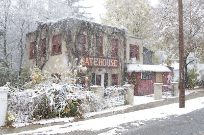
So here's the original image I started with:
First thing I did was to hit ctrl-J. That opens a new layer with the whole image (it actually creates a new layer with whatever is selected, but the whole image was selected...). Next I looked for problems (OK, "challenges"). There was an icecream ad on the right side of the front of the building. There was a power line. I didn't like the concrete pillar on the left. There was a telephone pole. I decided I could crop the pole out, but the rest would have to be cloned. So I got to work with the clone stamp. Oh, and there was a fuzzy water spot on the side of the building (it was snowing, you know. I did get some on the lens).
That took about 15 minutes. A little touch up with "Levels" to increase contrast, and I saved my work as a .psd file. Now I got the "black and white" feeling, and opened a "black and white adjustment layer". I went through the default filters, the one I liked best was the yellow one; but it wasn't quite what I wanted so I moved some sliders around. I wanted the GATEHOUSE sign more contrasty, so I decreased the red and magenta sliders, and increased the yellow.
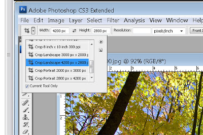
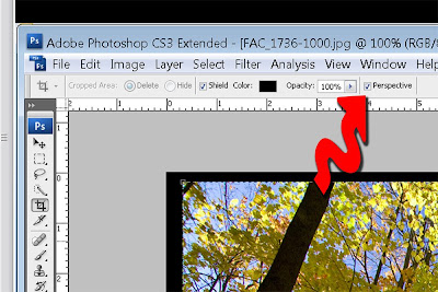
I started cropping it. I used a preset ratio of 3:2 (4200px x 2800 px) but that didn't give me enough foreground with the telephone pole cropped out, so I turned on "perspective" and dragged the vertical corners until I included what I wanted to see, while maintaining my aspect ratio. I slightly adjusted the angles to straighten both sides of the building.
Saving the image again, I wondered what it would look like with some selective colour, especially on the sign, so I clicked the layer mask on the adjustment layer and started painting with black to mask the sign. Cool! I flipped the layer eyeball off for a second and thought the window frames would look good in colour too, so I started painting again on the mask.
This all took another 10 minutes or so. I blew it up, ran 'round the edges and looked for problems, fixed a couple of things. I saved it again, then thought I'd put it on a matte; so I increased the canvas size by 400 px then selected the image part, copied it onto another layer and added a drop shadow. Almost done! I wanted to name the picture, so I did and matched the ink colour of the name to the red in the picture.
Another save, then we're done. Well almost -- I wondered if it would look better as a vignette, so I reloaded the image just after the canvas size increase but before the drop shadow, and ran a vignette action. I didn't like it. Back to the other version.
I flattened the image, sharpened it a bit, then saved it as a .jpg. Finally, I ran an action I call "resize 1000" which changes the horizontal dimension to 1000 px, to downsize it for the blog. I saved that one separately.
So all-in-all, about 30 minutes in PhotoShop. I kind of like it, do you? Comments are welcome, good or bad!
Monday, October 20, 2008
Winning Images
"Water Hazard". This scored the most points of the three, 8+8+8=24 but it was not on the assigned topic so it came 3rd in the advanced class under "Pictorial" images. The judges thought it had great timing, great flow and movement, rich and strong colours. They wondered if it had been over-sharpened.
Canoe in the Mist. No specific comments but they loved the image. It tied for 2nd place in the advanced group, assigned category. 7+8+7=22 points.
Beached Canoe at Dawn. This tied for 1st place in the advanced group, 8+9+6=23 points. Note the low score from the "Russian Judge". The assigned category was "landscapes, seascapes, cityscapes" and he thought it was off-topic because it was a picture of a canoe, not a landscape, so he down-scored it.
The 4th image I submitted was the Blacksmith shot (below a couple of days). When it was shown at the judging, there were some artifacts on the left and at the top but when I reviewed the image later, they were not there. It may have had something to do with the computer setup at the judging. Anyway, the image was marked down for that reason.
I'm rather pleased: 3 out of 4 images placed.
Friday, October 17, 2008
Cleanliness is next to...
(OK, that's frustrating. I just wrote the entire article, clicked "Publish" and it wasn't there. Grrr.)
So here goes (again):
FacZen Photography Tips Clean your DSLR Sensor
Here's the deal. Every time you change lenses, you open the camera body to the air. The air, which is full of gunk like dust bunnies, pollen, sand, greasy smoke, pollutants, and well-meaning camera owners' spit. In fact, unless you have one of those high-end lenses (you know, the Canon "white L-glass" ones or the Nikon lenses that cost you over $1000), every time you zoom or focus your lens, you're sucking dust inside. Now that doesn't get directly on your sensor. See, unless you’re taking a picture, the mirror is down, covering the sensor, airtight. Anyway, the sensor itself (which is a really, really precise Integrated Circuit which costs more to replace than you paid for your camera), is covered with a protective glass or mineral crystal cover, so dust and gunk gets on THAT, not on the sensor itself. Still, even the old D-70 has 6 million little points on it that detects light, so a flake of dust smaller than you can imagine can cover a bunch of them. No, it doesn’t get on the sensor protector when you change lenses, it gets on it when you take a picture and the mirror, moving in that compartment, moves the air around inside and the dust floats everywhere. The newer generation cameras, like the D300, have built-in automatic sensor cleaners which essentially vibrate the sensor assembly and shake the dust off. Still, it’s in there, and eventually you’ll be bitten by the dust bunny. So it’s time for me to say this: If you do anything as a result of this article and you damage your camera, IT’S YOUR FAULT. It’s not my fault. I told you not to do it. I told you to send your camera in. Don’t come crying to me. That said, it ain’t Rocket Science. That sensor protector is HARD stuff. It ain’t diamond, so you CAN scratch it or damage it, but it isn’t that easy to do. Still, if you’re going to do anything, be gentle. Be careful. I do want to caution you, though. How often do you have to clean it? How do you know if you need to clean your sensor? Where do you get a sensor cleaning kit? I started with some research on the Internet and learned that I should use a nylon brush, and blow air through it to statically charge it, then cautiously swipe the sensor. However I looked further and found what I think is an easier and a better method. I found “Copper Hill Images” at http://www.pbase.com/copperhill/ccd_cleaning (that’s an underscore between “ccd” and “cleaning”). I bought their “Basic” kit which cost me about $35 including shipping. You get a “SensorSwab”, a package of PecPads, some Eclipse liquid and lots of instructions. Preparing to clean your sensor • You’re going to need to lock up your mirror. Learn how. On the Nikon, it’s in the menu and the instruction book cautions you to us an AC power source so it doesn’t snap down in the middle of the procedure. I think that’s overkill – but I do make sure I have a fresh battery in the camera when I’m working on it. Actually cleaning it Follow the instructions they give you. Basically, you want to lock the mirror up, then swipe the swab across the sensor once, then back the other way (using the other side of the tip). Don’t give into any temptation to scrub things. Swipe with about the same amount of pressure you would put on a felt pen. Put the lens back on, shoot another test picture, and see how you did. If there’s still objectionable dust there (there will always be some...) do it again. If you’re really cautious, change the PecPad. The bottom line It’s not difficult, you just have to be careful. You don’t have to do it as often as you think, but it is a necessary task from time-to-time. As I said, it “ain’t rocket science”. So have fun, and don’t do anything I wouldn’t do. |
Tuesday, October 14, 2008
Resistance is Futile
No, I’m talking about taking pictures of the fall colours up here in the Haliburton Highlands. How can I NOT take pictures of the colours when they’re so spectacular? So forgive me for posting a bunch of postcard type pictures, I couldn’t help myself.
What’s different about these shots, compared with most of my previous work, is that there is virtually NO PHOTOSHOPPING done to these images. I may have cropped the odd one a little, but I didn’t push the colours, didn’t clone anything out (well I think there was one where I didn’t like the green bush in the lower corner so I did). No Hue/saturation layers, no meddling with curves. I will admit to a few adjustments in Camera Raw – for instance, I increased the saturation of the blue sky in a few images, but I never touched the leaves.
Anyway, enjoy the images. If you want to see them full-sized, go to my gallery, click on monthly photos and then on October 2008.
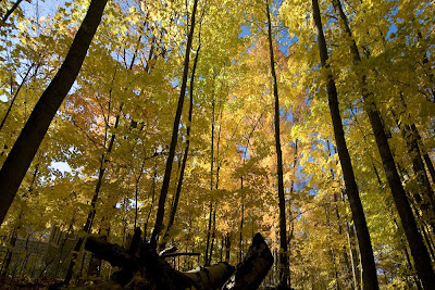
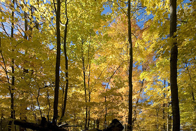
Did I tell you I LOVE my 12mm wideangle lens? I LOVE my 12mm wideangle lens. Sometimes I point it straight up…
Straight up! That's what a super wide angle lens is for!
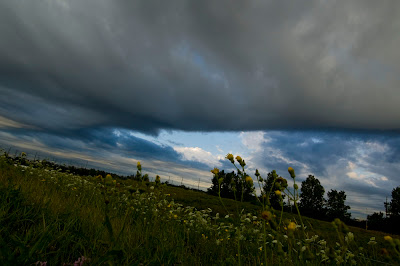
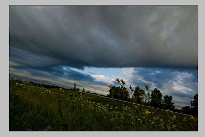
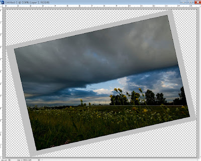
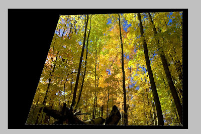
This is the same image, but I did a little "perspective cropping" to straighten the trees, just like you would in an architectural shot. Boring, isn't it? I like the first one much better.
This is right behind my house. Two doors away. I always loved old barns, the texture of rotting wood.
Here's today's photo tip. Thanks to Bob Fowler for the idea (he presented a similar one at the camera club a while ago).
FacZen Photography Tips Reset to Square 1Right after I got my D300, I started having some problems. I experimented with all kinds of things (as well you should with a new camera – learn how it works!), and then I wanted to shoot some pictures and they came out lousy. Exposure was off, focus sucked, even the colour balance was off. I couldn’t understand why for a normal daylight shot the camera chose 1/8000 sec at f/8. Then it dawned on me. I had played with the ISO setting and it was at 3200. Want to see colour noise? Try shooting at that kind of sensitivity level. I was demonstrating the Gary Fong Lightsphere to a fellow photographer, and the exposures were all off. Well not all, about 1 in 3 were OK. What was the problem? I had been trying out “bracketing” and I still had it on. Every time I pressed the shutter release, I got a different setting. So here’s what to do. Make a mental (or even a written!) checklist and reset your camera to the defaults at the end of every shoot. ISO back to normal (for me that’s 200). Metering back to matrix mode. Autofocus set to “single exposure” (not continuous), focus mode back to weighted average or whatever it’s called in your camera. Bracketing off. Exposure compensation back to zero. White balance to Auto (for me). Shooting mode to aperture priority. VR on. Quality back to RAW. Put in a fresh battery and reformat the memory card. ANY ONE OF THESE SETTINGS CAN SCREW UP YOUR NEXT SHOOT. Tell me you’ve never come back from a shoot and said, “damn, that didn’t work the way I thought it would”. So reset all your camera controls to default as soon as you finish a shoot. That way you’ll know where you are when you have a chance for that magic picture. |
Monday, October 13, 2008
First Light... revisited
It wasn't. Cloudy, no sunrise. Well the sun did come up, the Earth did turn in its orbit, but no spectacular colours today. It was, however, very cool. Not the temperature, the ambiance. The word "Tranquility" comes to mind. "Peacefulness".
Somehow pictures do have a different feel to them when there's a person in them. I shot one with and one without and there's no doubt which one I like better. This one:
As a regular feature, I'll be providing some photography tips here. I hope you'll come back frequently to read and comment on them.
Here's today's tip:
FacZen Photography Tips Explore your light meter. The modern DSLR (or even a point-and-shoot) camera has tons of computing capability but in the end, you have to make the decision whether your image should be exposed according to the light on a spot, on an average or on some computed combination (often called “matrix metering”). The best example is a backlit subject. If you expose according to the average, you’ll get a silhouette. According to the spot meter, the subject will be well exposed, and matrix metering will give you some compromise. “Digital Film” is cheap. Bracket your shots or switch metering modes and shoot several frames. |
Sunday, October 12, 2008
No pictures taken today -- I spent the day organizing all the stuff I had shipped up here last week. My office (3rd bedroom) is now more-or-less habitable. The trouble with going through old stuff is that you get sidetracked. I spent a lot of time looking through old pictures instead of unpacking.
Anyway, here's today's tip:
Saturday, October 11, 2008
Pictures of Rocks (Not!)
The purpose of the exercise was to move out of your comfort zone. Definitely, I'm not comfortable taking pictures of people. So I've been working on it. Here are some examples, I hope you like them.
I took this picture of "George" at the Deep Gorge Center near Lake Placid New York where we stopped for some photos. George was having lunch and I commented how much I liked his beard, and asked if I could photograph him. I got him to stand near a window and used natural light.
The exposure was handheld at 1/25 sec (thanks, Nikon, for VR!), one stop underexposed so that I didn't blow out any of the detail. Really the only PhotoShop work I did was to blur the background (easy to say, not so easy to do: I "extracted" his image and put it on another layer), and some small hue/saturation adjustments.
I only took one image, interestingly.
Nella is a motorcyclist, she's a member of the Acme Motorcycle club. They went on a ride today and I met up with them for lunch in Coboconk. Afterwards, I took a few pictures including this one of Nella.
People think I do too much Photoshopping. Maybe, but I like it and I think I'm getting better at it. This picture only needed a little work, because Nella's skin is soft and smooth, the lighting was great, she has a great smile and I love her hair. Still, I sharpened the eyes, desaturated the whites of the eyes, fixed up a few blemishes and did some work under her eyes. I softened the skin with a blur layer although I didn't really need to. I liked the above image, Nella didn't see it, I hope she likes it. She saw the next image on the camera and said she liked it so I worked on it as well.
Vanessa is Nella's cousin. She was along for the ride (as a passenger, her first time on a bike, BTW) and I tried to get some shots of her both inside and outside the restaurant. Not that successful, until I got home and saw this one on the computer. It was taken inside the restaurant at an ISO of 1600, which made it very grainy/noisy. Also there was some kind of lighting from her left side (stage right!) that was green in colour. So I managed to colour correct that (hue/saturation adjustment layer, select "greens" instead of "master"), then I looked at a crop of the image and loved it. I worked on the whites of the eyes a little, desaturating them, and I turned up the sharpening on the eyes. I also lightened their colour a little.
Before finishing the photo, I looked at it blown up and didn't like the noise on the lips. So I selected them and applied a gaussian blur to smooth them. The same for the whites of the eyes.
Speaking of her eyes, I loved them so much that I had to do a tight crop. Like it?
One more: This is Tom, the blacksmith at Fleming College in Haliburton. He cooperated with us for our workshop, acting as a model and we experimented with various lighting solutions. I used a Gary Fong diffuser on my SB-600 flash, but set it a couple of stops down so that it would act as a fill light not overpower the image.
Wde also ran into a couple from Toronto on that weekend, who coincidentally handed one of us a point-and-shoot camera and said, "would you take our picture for us?" Sure thing, since we were working on "outdoor portraiture"! I haven't worked on those images yet, so I'll have to put them up later.
Reminder: you can see most of my work on my gallery site here, or click at right.
L8R...
By the Dawn's Early Light
Liz, who works at Gonyea Eavestroughs, told me about a spot across from her house on Horseshoe Lake Road. I scouted it out yesterday and came back around 6:40am. I set up the camera on the tripod and captured this first image:
This one was taken at first light. It was about a 10 second exposure. I decided to put a person in the picture so I set the self-timer and walked into position, but I didn't realize that the timer was set for only 2 seconds, so I actually walked in in the middle of the exposure! Kind of a cool effect, huh? I named it "Ghost at First Light".
About 12 minutes later (ain't metadata useful?), exactly at 7:00am (plus 9 seconds), I got this shot:
About 45 minutes later, driving home, I was struck by the light filtering through the trees and stopped to take another photo. The camera decided on a weird White Balance: 3800K with -22 tint offset. Who knows why? Anyway, it took a bunch of colour correcting to come up with this shot.
Then I did a duotone out of it. I was thinking of using this photo to illustrate a short story that I wrote a long time ago, and which I'm thinking of reviving. Watch this space (not yet... too much other stuff to do first!)
By the way, I've taken to reducing the sizes of the images I post here. First of all, my internet connection is quite slow up here in TrueNorth. I have an Xplornet satellite hookup which only gives me about 128K upload speed (and download is blindingly slow at about 500K), and it takes a long time to post a 3Mb image. Also, there doesn't seem to be any copyright protection here. So if by any chance you want a print of any of these images, visit my gallery and you can order one there for a very reasonable price.
Friday, October 10, 2008
Hi from up North!
I did manage to find my Creative Zen Vision M which is a good thing, because I forgot my 1Tb backup drive at home, and I only have 8Gb available on the laptop hard drive. I'm waiting for the drive upgrade (apparently Vista makes it difficult to "Ghost" a drive and they want my computer for a couple of days to do the job. I'm going from a 100Gb drive to a 250Gb drive. That should be good enough for a week or two...
I took some time out at dusk to shoot some images. Just a few, I hope you like them:
You know what's interesting about this image? I didn't do ANYTHING to it. OK, I cropped off the bottom a little, but that's all. No PhotoShop. No extra saturation. That's really what the colours look like up here this year, I told you they're spectacular.
This one was enhanced a little bit, but not the trees! I exposed for the trees, so the sky was blown out a bit and the dock was too dark, so I darkened one and lightened the other.
I have to downsize my images a bit... uploading from this location (I'm on satellite here and it's slow) wait right here, I'll be right back.
OK I'm back. These took a lot less time:
I couldn't get this guy to turn around. He was across the water and couldn't hear me. 200mm lens, of course.
Now the following are 4 different treatments of the same subject -- not the same shot, 4 different ones, but handled differently. Which one(s) do you prefer?
I used PhotoShop's "Cutout" filter -- twice. This image was really noisy because I shot it at ISO 3200 just to see what it would look like. Right. It's noisy. So the cutout filter converts it to "art" and the noise is gone.
I kind of like this composition. I dodged the underbrush under the trees a little, and except for sharpening and cropping, that's all I did.
Tight shot, landscape orientation...
...and portrait.
OK, I'm setting the alarm for 5:55am tomorrow and going to try to get some sunrise pictures. I scouted out a spot, let's see if it'll be what I think it looks like.
a demain!