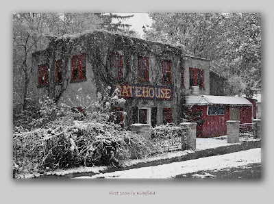
So how did I create this image, you may ask? If you didn't ask, that's OK, I'm going to tell you anyway. I'm putting on my "instructor" hat.
First thing I did was to recognize what (I think) is a good photo opportunity. I drove past it, thought about it, turned around and grabbed the camera. Braving the snow and sleet, and the trucks going by threatening to inundate me with wet slush, I chose my viewpoint and took the exposure. Before I did, I made sure that I selected 200 ISO, and I spot-metered on the building because I didn't really want an average exposure. Snow is NOT 18% grey... of course I took several exposures, mostly to find the best viewpoint because I was pretty sure of the exposure values themselves.
I opened the images in Bridge and selected the one I wanted to work on. Double-clicking opened it in Camera Raw where I did some minor adjustments. I didn't touch the colour balance -- I didn't know then what I was going to do with it, but it looked pretty good to me. I brought the exposure down, added some black, and a bit of sharpening. Then I opened the image in CS3.
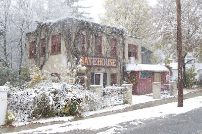
So here's the original image I started with:

First thing I did was to hit ctrl-J. That opens a new layer with the whole image (it actually creates a new layer with whatever is selected, but the whole image was selected...). Next I looked for problems (OK, "challenges"). There was an icecream ad on the right side of the front of the building. There was a power line. I didn't like the concrete pillar on the left. There was a telephone pole. I decided I could crop the pole out, but the rest would have to be cloned. So I got to work with the clone stamp. Oh, and there was a fuzzy water spot on the side of the building (it was snowing, you know. I did get some on the lens).
That took about 15 minutes. A little touch up with "Levels" to increase contrast, and I saved my work as a .psd file. Now I got the "black and white" feeling, and opened a "black and white adjustment layer". I went through the default filters, the one I liked best was the yellow one; but it wasn't quite what I wanted so I moved some sliders around. I wanted the GATEHOUSE sign more contrasty, so I decreased the red and magenta sliders, and increased the yellow.
I started cropping it. I used a preset ratio of 3:2 (4200px x 2800 px) but that didn't give me enough foreground with the telephone pole cropped out, so I turned on "perspective" and dragged the vertical corners until I included what I wanted to see, while maintaining my aspect ratio. I slightly adjusted the angles to straighten both sides of the building.
Saving the image again, I wondered what it would look like with some selective colour, especially on the sign, so I clicked the layer mask on the adjustment layer and started painting with black to mask the sign. Cool! I flipped the layer eyeball off for a second and thought the window frames would look good in colour too, so I started painting again on the mask.
This all took another 10 minutes or so. I blew it up, ran 'round the edges and looked for problems, fixed a couple of things. I saved it again, then thought I'd put it on a matte; so I increased the canvas size by 400 px then selected the image part, copied it onto another layer and added a drop shadow. Almost done! I wanted to name the picture, so I did and matched the ink colour of the name to the red in the picture.
Another save, then we're done. Well almost -- I wondered if it would look better as a vignette, so I reloaded the image just after the canvas size increase but before the drop shadow, and ran a vignette action. I didn't like it. Back to the other version.
I flattened the image, sharpened it a bit, then saved it as a .jpg. Finally, I ran an action I call "resize 1000" which changes the horizontal dimension to 1000 px, to downsize it for the blog. I saved that one separately.
So all-in-all, about 30 minutes in PhotoShop. I kind of like it, do you? Comments are welcome, good or bad!

Wow, interesting. I just thought you had a better camera than me! :P
ReplyDeleteWell you do have a Canon, after all...
ReplyDelete