Showing posts with label photo tips. Show all posts

Sunday, September 13, 2009

Some camera and monitor tips

Today's Blog is about fixing a camera/lens problem, and about a tip for making life easier for you multiple monitor types.

Micro-adjusting your focus

For the past little while, I’ve been dissatisfied with the sharpness of some of my images, especially with the wonderful, professional, Nikkor AF-S VR 70-200mm f/2.8 lens. You would think that with this almost-$2000 lens, this would be the last issue you would expect. I’ve had the uneasy feeling that something is wrong.

I experimented. The autofocus, or even manual focusing was off. The image would look sharp through the viewfinder, but not on the finished image. Somehow, the big Nikon zoom and my D-300 were not getting along. My guess is that normal wear and tear changes the alignment of the lens in the mount. I never dropped or banged the lens or camera, so there was no abuse. I figured it was inevitable that I'd have to send my equipment in to Nikon for adjustment. Not under warranty, either — I bought the lens from B&H in New York.

My first clue of a solution was when I read a review of a piece of software called “LensAlign Pro” in the latest issue of Photoshop User magazine.

This is a software package that comes with some focusing targets and a ruler. In the article, and on their website, http://www.lensalign.com/, they mentioned that some of the current higher end DSLR’s have a menu-driven micro adjust of AF-tuning built in. Sure enough, the D300 has it. So do a lot of other DSLR’s — here’s a list that I found through that site:
  • Canon
    • 1DsMkIII
    • 1DMkIII
    • 5DMkII
    • 7D
    • 50D
  • Nikon
    • D3x
    • D3
    • D300
    • D300s
    • D700
  • Sony
    • A900
    • A850
  • Olympus
    • E-30
    • E-620
  • Pentax
    • K20D
    • K7D

If your camera does not have this feature, it may have to go back to the manufacturer for adjustment, which I know is time consuming and expensive. You would have to ship the body and any lenses that need alignment to them.

Now with all due respect to the makers of this “LensAlign” product, I’m not sure why you actually need it. Here’s what I did without spending dime one.

I took a tape measure and tied it to the tripod then let it run outward along the ground, straight away from the camera at about a 30° down angle. I focused on the red 7’ mark, took a shot and here’s what I got (click the image to blow it up):


Now I went into the menu and after about 10 trial-and-error adjustments (I ended up at +7 on a scale of -20 to +20, here’s the same shot. Enough said?


And it obviously worked: check this out!

This is cropped out of an image captured from about 8' to 10' away, at
200mm, f/2.8. If I hadn't cropped it, you would be able to see focus fall-off at
the edges of the leaf because it wasn't exactly at right angles to the focal
plane. In other words, the top of the leaf was further away, so it was out of
focus.
Oh by the way: September 13. Fall is imminent in Northern Ontario.

In the D300 (I don’t know about other cameras), the AF-tuning is specific to the lens. Change lenses, and set an adjustment for that lens. It knows which lens you have mounted and will microadjust automatically for that lens. Also the camera will save up to 99 different adjustments for each lens – so I’m guessing it might be different at minimum focus distance (like I used) or at other distances, so you might need more than one setting. I’ll experiment when I have time – but the most critical adjustment is when you’re focusing close and wide open. In this case, 7’ and f/2.8. But I get that when you shoot portraits, for instance, the near eye has to be tack sharp. The next lens I'm going to do is the 50mm f/1.8.

Dual Monitor Bridge Trick

Another trick I picked up in the same magazine is for Bridge users who have dual monitors. I clicked on Window --> New Synchronized Window, then dragged the new window to the big monitor. By dragging the boundaries of the file list, the thumbnails and the metadata, you’re left with one huge preview window. Now if you click on an image on the other monitor, it comes up full size on the big one. Even better (this wasn’t in the article): click on the big image then hit the spacebar. That puts a full-screen image on the big monitor and the scroll wheel on your mouse will let you zoom in up to 800%. Scroll through your images with the arrow keys. That’s how I selected the sharp leaf image.


Just before I go away, here are a couple of images I took from my dock a couple of evenings ago. This blue heron was fun to watch. Have you ever watched a cat hunting? Same thing: the bird spots a fish and moves into position in ultra slow motion and then strikes. I got him just as he caught a little minnow. Later I tossed a pebble to make him fly off so I could get a photo in flight.


Wednesday, April 22, 2009

I'd like to thank all the little people...

Recognition: ain't it great?

I like a lot of my images. But it's SO much better when other people acknowledge that they like them too. So, without further ado (but a virtual drumroll...)

My Mountain Man digital painting took FIRST PLACE in the ADVANCED CATEGORY at the Richmond Hill Camera Club Print Competition this week.

It wasn't the printing quality: All the prints in the competition were put on paper by Costco, all to fit within the same size mat.Three professional judges loved my picture.

Ah, the glory. The adulation. The women falling all over themselves just to be near me... OK, but I'm still proud of the work I did on that picture and I do want to thank Hilarie for teaching me how.

PS. Scroll down to the March 24th blog, or search for "Mountain Man" to find it.


On to bigger and better things. I'd like to show you an image I worked on this week in Photoshop, tell you a little about how I did it, and introduce you to a tool you likely haven't used. I'm also looking for comments: the jury's out as to whether I like this image treatment or not. Do you? Please post a comment. Anyway here goes:


FacZen Photography Tips

The pen tool in Photoshop


There's a tool in Photoshop that lets you make the cleanest, most precise selections possible of smooth geometrically shaped objects. It's the PEN tool, and it works with Bézier Curves.


Greek, right? Well not really. Pierre Bézier was a French engineer who used them to design automobile bodies.They were actually first developed in 1959 by a fellow by the name of Paul de Casteljau (Wikipedia, where you can learn more than you ever wanted to know)

I'm not going to try to give a lesson in higher mathematics. What you have to do is try it and figure out how it works for you. Bear in mind that the [alt] and the [ctrl] keys ([cmd] and [option] on a MAC) will modify how the tool works.


What you do is to select the pen tool, then draw a path around the object you want to select. You do this by adding points as you go around the object. Put one wherever the curve changes direction or changes shape. Now go back and with the alt key, you can move the points to exactly where you want them. Now click a point with the "convert point tool" which is nested under the pen. It changes it from a linear point to a Bezier one. You will be able to drag two handles away from the point -- and the distance and the direction that you drag them changes the shape of the line joining the points. Try it. It's easier to do than to say.


The path is very precise. And because it's a vector, it's perfectly smooth. Blow your picture up and get to work until the line matches the area you wanted to select! Here:


(the lines are faint. Click on the image to blow it up to see it better). The path doesn't exactly match the curve. But watch what happens when you drag the handles:


Voila! Perfect selections. Here's another view of a different area of the curve:


OK. When you're done, you've created a PATH, not a selection. Now you have to save it as a selection and I'll leave it to you to figure out how to do that (hint: there's a "Paths" palette, just like the "History" palette or the "Layers" palette"). Now you can do whatever you want with that selection -- put it on its own layer, fill it, stroke it, warp it, whatever you want!

So here's an image I created using this technique.


What I was trying to do was to enhance this image of a steering wheel and dashboard. I wanted to add some 'artsy' effects to the dashboard and frame it with the texture and curve of the wheel. So I used the pen tool to select the dashboard and put it on its own layer. I converted the original to a duotone and added some lighting effects to bring up the texture. Then I went to the dashboard layer, added some strokes and stuff in "Filters", played with the blending modes and gave it a green glow.


So take a minute to comment: do you like the image? Hate it? Want to pay $1000 for a signed original?

The bottom line: There's a selection tool in Photoshop that allows you to make VERY precise selections. It's a little tough to use at first, but it's worth it!

Sunday, April 05, 2009

Spiffing up boring scenics

I was debating which of two photographic techniques I wanted to talk about today. I haven't been doing much photography over the past few weeks because I've been busy with work and other stuff, but there were a couple of learning experiences I wanted to share.

I decided that a discussion on spiffing up some forest shots in the boring and ugly early spring would be good to do first since it might inspire a few of you to go out and try it, instead of sitting at home bemoaning the fact that the world isn't pretty out there right now.

The other topic worth writing about is a foray into HDR, because the results can be fascinating and the technique is not entirely intuitive. I teased you a couple of weeks ago with an unfinished HDR image, I can document how I did it, but I'll save it for next time.

Before I get into it, I had occasion to shoot the Group photo for the Humber Motorcycle Instructor cadre a couple of weekends ago. I was looking forward to it because I have the new D300 and last year's shot, with the D70 was excellent. I looked forward to surpassing it. I was a little disappointed. Last year's was better. Somehow I managed the perfect exposure last year (I don't mean in terms of f/stop, etc -- I mean the ease of manipulation of the RAW file, the resulting super sharp image). Odd, because I used the same lens, the same camera location. It just showed me that you don't need 12 megapixels to do a sharp 18" wide print. Anyway, here's this year's shot:


As in previous years, I learned that you have to take several exposures when you're doing a group shot. Invariably, someone will have their eyes closed or a funny expression on their face, so you have to have a backup photo that you can clone a face from, etc.

I put some effort into arranging the people this year, according to height. It worked, but I think I'll do something different next time because the group is too big, the photo too wide. I had to clone in all kinds of vegetation around the sides. I'm thinking about shooting from higher overhead, getting people into a more square grouping.

OK: let's get out in the forest!


FacZen Photography Tips

A silk purse from a sow's ear!


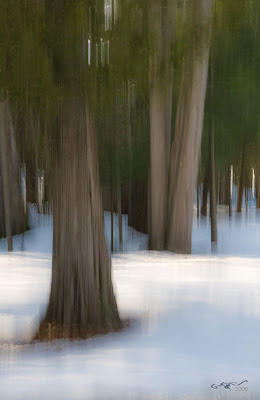
You know that expression, right? In this case, I had the camera out with me and the whole world was just shades of mud, with a sprinkling of snow. So I tried something different, something that I mentioned before: I tried moving the camera during the exposure.


Here are a few images I took over the past few days:


Early Spring 2


Early Spring Forest Giant

Still Frozen


On the Lake

So what do these pictures have in common? Lots of obvious things, but there's one point that really stands out in my mind: No Photoshop!* They aren't even cropped! They are exactly what came out of the camera!

All of the effects that you see here were created by moving the camera during the exposure.

* OK, not quite. You have to know me better than that! All I did was to open them in Camera Raw, tweak the exposures slightly, REDUCE the clarity to make them softer and increased the vibrance, a minor curves adjustment to the dark tones, then opened them in Photoshop, straightened a couple of them up slightly, added a new layer and stamped my signature and date on, applied a bevel/emboss to the signature layer and reduced its opacity, saved them, flattened them, then saved them again as jpegs. Like I said, no Photoshop!

So let's get physical. What do you have to do to capture these kinds of images? There are two main things that effect the kind of results you will get (apart from the obvious, making sure the exposure is right, the composition and focusing on the right spot). They are: shutter speed, and how you move the camera.

Of course you know I'm going to tell you to experiment. Digital film is cheap and you might be amazed at the different feeling you get with different techniques, but after some playing around, I decided that for me, an exposure around 1/15 second was the best. Slower than that and you get too much blur and it's hard to control; faster and the effect is too harsh if you can see it at all. I also discovered that you have to move the camera parallel to the direction of the trees. In other words, up and down. But look at the last image. I moved the acmera at about a 30 degree angle for this one. Different effect!

So I set the camera so that I would get a good exposure at that speed (some were shot at a very low ISO and some with a very small opening like f/22). Then I focused on the the main object in the picture and as I released the shutter, I swung the camera upwards.

Although the rules of composition still apply (rule of thirds, interesting foreground/midground/background, etc), they become less critical because the motion, the "painterly effect" adds an interest of its own.

So pictures which would be exceedingly boring, in fact downright ugly what with all that mud and muted colour, become interesting. For what it's worth, I had a couple of these printed as 18x12 images and they're out being framed even as we speak!

Wednesday, February 18, 2009

Enhancing Photographs

Someone very close to me lost his daughter to cancer a few years ago. He has prepared a manuscript for submission to a publisher and asked me if I could do something with a couple of pictures he had, one for the cover, one for the inside. I was more than happy to help out. I asked him if he minded if I wrote up my workflow in the form of a Photoshop tip on my Blog and he readily agreed, but he asked that his name not be revealed. I replaced his name and removed that of his daughter for this article.

FacZen Photography Tips


Some Photoshop techniques


The purpose of this article is to walk you through the thought process and the steps I took to produce the requested image. I know that not everything I did was correct, but my intention is to show some of the things you have to think about when you're asked to do something like this, and maybe a little bit about how I achieved the results I was looking for.

Before I agreed to go ahead, I need to know if the photos were of sufficient size and quality to work with. I received the photos as email attachments. Both were .jpg's and both were large enough. It looks like they were taken with a point-and-shoot camera of some reasonable quality. On close examination, the focus was off (the wall was in focus but not the girl) and some areas were blown out by overexposure, but it wasn't too bad.

This is the original photo I received (reduced in size for this Blog)


My first question was, "what do you want to do with this picture?". I was told that he wanted it as a cover picture for the manuscript he was submitting and that he would be printing it in black and white on a standard HP Laserjet printer. He wanted the text to frame the image but I decided to make it part of the finished picture. He told me he wanted the title to be large, the subheading medium and his name to be small.

Since he told me he was submitting it to a publisher, I thought it would be wise to produce a sufficiently high quality image to be printed on a press. I knew that 240dpi was generally fine for both a laser printer and a press; and I decided that 5"x7" would be a good final size. I figured he probably wouldn't be printing in colour down the road, so I was going to convert the photo to black-and-white. If he wanted colour later, I'd have to go back and redo it.

Using Bridge, I opened the picture in Camera RAW. I wanted to do a few things there before taking it into Photoshop; for instance straightening it up (Bridge has a great tool for aligning an image horizontally) and doing the monochrome conversion. While I was in there, I reduced the exposure and added some recovery for some of the blown out white areas, and did a little preliminary curves work to start bringing the face out. Use the sliders when doing the black and white conversion, especially the red one for the skin tones.

All right, into Photoshop (CS4). First step: ctrl-J to duplicate the background layer and ctrl-S to save a PSD file just in case. I use lots of keyboard shortcuts, so ctrl-0 (that's 'zero', not 'o') will blow it up full sized. Normally one shouldn't crop until later, but I knew what I wanted so I went ahead and did it now. I preset the crop tool to 5" x 7" x 240ppi, then I dragged on the image and moved it around and resized it until I saw what I wanted. I wanted her off-centre, looking into the image and I really hated the way she was standing with her shoulders forward and hands hanging, so I cropped the bottom. I also cut space off the top: to my regret, so I had to fiddle with it later as I'll show you.

I opened up a curves adjustment layer and blew up the image so I could see the effect on her face. Then I ran the sharpening tool at a very low density (10%, I think) over her jacket, hair and face. Here's what I had at this point.


The tile and the brick wall are distracting. I needed to do something about that, and remember, I want to lay some text over this picture. I created a new duplicate layer from the background layer, then applied a Gaussian blur to it. Next came a quick and dirty technique. I activated the sharp layer, then I simply erased around the girl with a soft brush. The Wacom tablet helped, it's a lot easier to be accurate with that than with a mouse. I could have done a fancier selection, but this did the job. Now the background was in soft focus and the girl was sharp.

OK, next step. I have to lay a title over the top of the picture but I didn't leave enough space above her head. Oops. Now I could start over or... I could use a new tool in CS4 -- content-aware scaling. What I did was to select everything in the picture from the top of the girl's head downward, then I dragged the top handle down using this sneaky tool. That left more room at the top without affecting the proportions of the girl. Now I simply selected the top portion and using regular scaling, I dragged it down to seamlessly mate with the rest of the picture.

One more thing before I show you the next step: I wanted the text of the subtitle and author's name to stand out, so I wanted to put a graduated dark screen at the bottom. I also wanted to hide those arms that were in a funny position. So I created a gradient map adjustment layer, clicked on the mask and laid in a graduated screen. I dropped the opacity until it looked right to me.


Blurred background, rescaled, and prepared for the text! The white keyline is to separate it from the black background of this Blog.


OK, now the text layers. I chose 36pt Hobo Std and grey type for the headline, and added a drop shadow to the layer. Then I used Palatino italic and regular in smaller sizes for the subheading and author.

I went back over the image and fixed a few things: a white artifact at top left, and I used the burn tool on her face to darken it a little. Done. All that was left was to save the .psd file, then flatten the image and save it as a .jpg. Here's the finished product (with some typographic changes to preserve anonymity).


This image can be used as requested for printing on a laser printer, and if the manuscript ever gets published, it can serve as a front cover with almost no additional modification. The white keyline is to separate it from the black background of this Blog.


Sounds like a lot of work? Maybe, but everything was straightforward. The lesson is to use lots of adjustment layers so that your work is non-destructive and to save frequently as you go along. The whole thing took me about 45 minutes to do.

I hope it gave you some ideas for your next project, and some hints about what to look for and how to achieve what you have in mind. I'm obviously not the sharpest PhotoShopper around, so if I can do it, so can you!


We're talking about doing a couple of Photoshop courses in Toronto and maybe up in the Haliburton Highlands (the latter coupled with a photo workshop). Both basic and intermediate level. I'm not the principal instructor, we're talking with a professional trainer, but maybe I can help a bit. If you're interested in participating, in sharpening your skills or learning basic PhotoShop, drop me a line and let's talk!

Wednesday, December 17, 2008

I'm a published author!

It’s been a busy couple of weeks. Well, busy in the sense that I’ve been working on a project and have been sitting in front of the computer for lots of hours to get it done.

The project? My first Blurb book. Yes, now I can say that I am a published photographer and author. The fact that it’s self-published, and I only ordered a couple of copies to see how it turned out does not have to come up in conversation. UNDERSTAND?

I put together a 40-page 8x10” (landscape) hardcovered book with a sleeve. It’s called “The Path of Least Potholes”, and to find out why, I guess you’re going to have to buy a copy! Blurb is not that simple to use, but considering we’re generating a whole book here, it’s not that bad. I’ll talk about the process and some of the mistakes I made (me? Misteaks?) in my photo tips section below.

I got an email from them telling me my book has shipped. Can't wait to see it! I'm published!

Last week when I started writing this, I was staring out the window at the snow coming down. I was up in “True North” (as I am now), of course. The lake was now iced over. a couple of nights before, there was open water and the setting sun lit the steam coming off it, reminiscent of a misty dawn. It was tough to capture on camera.

When I woke up the next morning, it was -22°C and everything outside was crispy crunchy. It was a beautiful winter day and when I walked down to the dock, Susan from the Inn across the road told me to check out the frozen ice crystals on the fresh lake ice. They looked like giant snowflakes, so I went back for the camera and took a couple of shots.


These crystals were about 2" (5cm) across. I false-coloured the image to make them stand out.


I also took a couple of shots of my axe, embedded in a log I was splitting for kindling. I painted the background, since it was kind of messy. I’m calling it, “That’s Life NOT in the Big City”.


When I came back in, I waited for the camera to warm back up to room temperature, then set it up to take a couple of self-portraits to use for the back flap of the book. Don’t you hate pictures of yourself? I do…

This is my workstation up at "True North". I've since moved a larger widescreen monitor up here.

By the way, last week I got a few images at the landfill (OK, the “dump”) when I dropped off a bag of garbage. It’s not going to win any prizes as ‘prettiest photo of the year’, but it does tell the story of what they do there. They’re feeding a whole mountain of stuff into that big red machine which reduces things to one or two foot size chunks. Then they plow it all in (that’s why they call it a ‘landfill’.


Planning is well under way for the Pixel Painting workshop we're doing with Hilarie McNeil-Smith in March. Watch this space for an announcement in the next week or so.

I did buy the Wacom tablet I mentioned last time: Future Shop has them on sale for under $100. If you're planning to attend the workshop, you need one. The Wacom "Bamboo" is $79 but the "Bamboo Fun" is only $20 more. You get a mouse with it as well as some software, so it's worth it. It's seamless. No issues with multiple monitors, no locking up the computer, works great.

FacZen Photography Tips

You too can be an author!


There are a number of online companies who will help you publish your own book. The one I used was “Blurb.com”. They seem to be quite affordable, much less than the likes of Vistek or Black's, and from what I’ve seen, their quality is quite high. There are some limitations but there are some workarounds that can make your book fully customized and looking just the way you want it.

The first thing to do is go to the blurb website and download their software, called "Booksmart". Version 1.9 is the current one as I write this.


My book cover

Even though I put together a small book (only 40 pages) as a first test, I realize that workflow is an issue. Jim Camelford (he’s published a couple of hefty tomes) gave some hints which I unwisely ignored, so here they are again, but in my words.

The concept is like this: Blurb offers several designs from a small square book to a large format coffee table sized book (13x11”). You can have as many pages as you like in it, up to 440 pages (now THAT would be a book!). There are dozens of page layouts provided by Blurb, but you can’t modify them. So if you don’t find the layout you want, you’ll have to work around it.

You make .jpg files to fill the containers they provide. So if a page has two 5x5.5” image containers in it, that’s what you give them. The problem is, you’re probably going to end up cropping your pictures to fit their layout, unless you use a larger container and drop the pictures wherever you like in it. You could drop, say, a 5” x 3” image in a box and align it top or bottom or middle. You could also use a full-page bleed, create a suitably sized image in PhotoShop and position things where you want. Text too. Work with a grid, though, especially if you're going to put a customized page opposite a standard one. All files should be prepared for printing: proper exposures, clean cropping, sharpened appropriately, 300 dpi resolution and high quality. You get out what you put in.

You could just drop your pictures into the Blurb containers and let the program resize or fit them. But then the sharpening and resolution wouldn’t be optimum and, well, it is your book, so you decide.

Pre-plan your text. Blurb has several default styles: body text, headings, captions, etc. Choose the font, size and colour for each of these and store them as defaults. You should make everything consistent through the book.

The thing is, PLAN YOUR BOOK FIRST. Collect all your photos and text in one place then make subfolders for each section (which could be just one page!). Decide what fonts and colours to use and preset them. Decide on picture sizes and prepare them in advance. Here are a couple of things Blurb doesn’t tell you:

1. You don’t need to import pictures into their library. You can just drag them from Explorer or even Bridge directly into the program.

2. Resize them according to the pixel sizes given in Blurb. Not 6”x6”, 1801px x 1796px. By the way, in Photoshop be sure to enter “px” in the crop size box or you’ll end up with inches. 1801 inches is one HELL of a big file!


One of the page layouts from my book.


3. If you’re working in Word to write the text, set the font, size and colour to what you want in the book. If you have to, change the page colour so you can see your text (I couldn't figure out what was going on until I realized I was trying to look at black text on a black background!).

4. Try to be consistent. Your book will look MUCH better if pages look similar throughout. Stick with only one or two fonts and colours and sizes; try to keep the page layouts the same or similar.

Creating the book is a tedious process. And "niggly". I scrolled several times through the book and found little problems every time. Remember, this is going to be printed, so you have to get it right.

When you're all done, you connect to the Blurb site and upload the book for printing. Remember, it's a pretty big file so it will take a while even at high speed. Then you need to tell them how many copies, where to ship them and give them the usual credit card information. My 40-page book was $33 (I chose premium paper), plus shipping.

So go for it! You can be a famous author and published photographer just like me!

Sunday, November 30, 2008

Long time No write!

What have I been doing for 2 weeks? Not writing in the Blog, that’s for sure.

The photo tip I have for you today is how to buy outstanding full colour business cards with your own artwork.

Lots of photographic stuff that I’ll talk about a bit; not all of it taking pictures that I can show you, though. . I’ve only been shooting pictures sporadically except for a couple of assignments (there's a lot of that going around. I just read Shannon's Blog and I think we're in the same place!), I’m up North and actually enjoying the onset of winter,


What happens during a power failure? With not much to do, I played with taking spooky pictures and I put my crockpot on top of the fireplace to hopefully keep cooking my dinner! This was a longish exposure, moving the camera, with a flash at the end.

I’ve been working on some workshops and seminars. Let’s start there.

I did a workshop on non-destructive Photoshop techniques for the Club that I wasn’t satisfied with. I got off-track and didn’t prepare well enough. You ever go brain-dead? How about in front of 24 people? How many times have I hit alt-shift and clicked on a layer mask to superimpose it on a layer so I could see both; I couldn’t for the life of me remember how to do it at the workshop. Lesson learned, I’ll do better next time. Best part of it was the “head swapping” exercise from the group shots that I mentioned a couple of weeks ago.

I’m working on developing some workshops which I’ll teach or work with experts teaching. We’re not there yet, but watch for it at http://www.photography.to/ (you have to admit that we got a cool web address!). Stay tuned.

On to some hardware stuff. I’ve tried to live a philosophy that I’d like to share with you. “Always buy the best”. It doesn’t always work — money jumps up and rears its ugly head — sometimes I buy lesser quality stuff just to try it, intending fully to upgrade later. Such was the case when I found a “cheap” graphics tablet at Tiger Direct. It was made by “Genius” and was only $70. How could I NOT buy it. I knew that I really should buy a Wacom tablet but this one leapt off the shelf into my hands.

Mistake. Not only did it cause my computer to crash (with no available restore points – another sad tale), but also I discovered that (a) it doesn’t work with dual monitors and (b) the drivers for CS4 aren’t written yet. Fortunately, I was able to get my money back. Now I’m looking for a REAL Wacom tablet. That said, although there’s a learning curve for working with a tablet, it’s very cool. I’ll get one soon.

Read my lips. “Always buy the best”. Don’t put yourself in the position of saying, “Gee, I wish I had bought the [fill in the blank here]”.

I mentioned above that I shot some assignments this week. I did. One was my usual ID card thing, I’ve got that down to a science. I shoot about 40 people, bring a small printer with me and by 10am, I’ve printed and delivered all their pictures.

Yesterday, however, I had an interesting project: I got to shoot some live models. As opposed to dead ones, like rocks and trees. Unfortunately, the client won’t let me post any of the photos I shot, but it was really fun. Let’s just say the goal was to create a holiday greeting card for a retailer and the idea was to have the store owner with a couple of beautiful women draped all over him, a glass of champagne, “Happy Holidays”. The women were spectacularly beautiful and so easy to shoot. We did do some really sexy shots as well that the client can’t really use publicly and I learned that posing them – especially the one girl who was experienced as a model – was not that difficult.

What was tough was the venue – a small store. Good backgrounds were hard to find (the client wanted to show the store, so I couldn’t bring a backdrop). They also didn’t want me setting up a bunch of lights, so… Gary Fong to the rescue! I love using this damned simple piece of Tupperware plastic and if you don’t have one, get one. Now. Go. (I’m a Loblaw’s commercial for Cheesecake). I wish I could show you the pictures. At one point, I set the D300 to commander mode and the remote trigger on the flash on. I put the flash over on a counter about 10 feet away from the camera. I added a little fill light from the on-camera flash (almost 2 stops under). Excellent!

Another neat trick was to use the radio remote shutter release. I set the camera up on a tripod, and I was able to walk over and talk with and position the models, get them looking in the right direction, and shoot by pushing the button in my hand. Or use Live View and stand back and compose the picture on the viewscreen.

It occurs to me that if you don’t have a D300 or at least aren’t familiar with some of the Nikon features, you won’t know what I’m talking about. “Commander Mode” is setting up the camera to control a remote flash, not attached to the camera. “Live View” is being able to compose your picture looking at the big LCD on the back of the camera instead of through the viewfinder.

I spent a few days up North last week, and the weather caused a few challenges. It snowed. In Toronto, they got a couple of centimeters, here: almost a foot. Heavy, wet snow. So heavy that the branches of my evergreen trees, which normally the oil delivery truck can drive under, were actually touching the ground!


The stuff also stuck to my satellite dishes — TV was OK but the internet dish (Xplornet) couldn’t connect. I hate being off-line. I also hate ladders, but I did climb up and clean it off so I could get back on.


While I was up there, I plowed snow off the roof, then I cleared the driveway, breaking the shear pin in the snowblower.


Long day…

I was exhausted and although I shot a few pictures, I wasn’t inspired. However I did shoot this scene on the way home on Thursday.


There was no light in the cabin when I shot this. It was daytime. Can you say, "Photoshop"? By the way, this was a 1/20 sec exposure with the 200mm VR lens, resting on a fence gate.


So on to our photo tip of the day. Of the week. OK, of the semi-month!


FacZen Photography Tips

Business cards from your own pictures!

Due to my former life as a desktop publisher and print broker, I still have some wholesale contacts with people who don’t deal directly with the public. One of them is really great trade printer. Although they do other stuff too, they focus on Business Cards. And they’re really good at it. They do runs of 1000 cards or more at a time.

Their claim to fame is a full-colour card, printed on both sides of thick, rich stock, coated with a high gloss or now with a matte lamination. I tested the latter last week and I LOVE the rich results.

Now that said, you need to have the right picture to benefit from the matte finish. It should have plenty of “pop” and not too much detail and complexity. If it does, glossy works better. If you go to http://www.photography.to/, you can see what I put on the back of the card, although I punched up the saturation when I did. Those crop marks and stuff are part of my graphic design.

If you want some cards with your own images on them, I can get them for you. Here’s what you need to do:

  • For each side (of course you could leave the back blank) you need a 3.75” x 2.25” image at 300dpi. They’ll trim 1/8” all around so you end up with a 3½” x 2” card. There’s a template you can use to show you where it will be trimmed and the area you should keep your type in. Ask me for it.
  • You have to finish it completely. Lay all the type down, do all the stuff to complete it, flatten it, crop it to size, and sharpen it appropriately,
  • You need to convert it to CMYK from RGB.
  • Now save it as a .tif file, lossless if any compression.

How much is it going to cost you? $95 plus taxes and shipping. If you’re in Ontario, that works out to about $120, all in. Call any printer and ask them to quote on 1000 cards printed 4/4 full colour full bleed on 14 point C2S card stock with writeable aqueous coating on both sides. Delivered to your door in a week or so by UPS.

Subtract $15 if you only want it printed on one side. Add $35 if you want it on 16.5 point stock with matte lamination.

Remember: you’re doing ALL the artwork. We’re just printing what you give us, so we’re not responsible for any typos, errors, etc. Yes, I’m making a (small) markup on this, but someone has to pay for my Blog!

Contact me directly at photography@faczen.com for more information.

Sunday, November 16, 2008

Groups & Quick 'n Dirty Workflow

Last night, I shot the Humber College Motorcycle Instructors annual awards banquet. I told them I didn't want to be paid for the gig since I wanted to enjoy the evening, and I'd do photos for them (for us) as a favour. I also didn't want to treat it as a professional project, in other words, I didn't want to spend hours editing the images. That said, I do have some pride, so I wanted to deliver some quality images.

I was asked to capture the groups of people getting awards, and I also shot around the crowd to get some pictures of the audience. I used the Gary Fong diffuser on the flash all night -- some people asked me, "why do you have a tupperware bowl on your flash?" The answer is obvious when you look at the great lighting on the images. I shot a group of 8 people and had even lighting all the way across! Anyway, here are some tips about what I did to photograph the event.


FacZen Photography Tips


Shooting groups and quick-and-dirty workflow

  • I prepared the camera. Knowing I was going to use the diffuser and the flash all night, I set the ISO to 500, aperture to f/5.6, WB to 'flash'. I made sure I had an extra set of flash batteries and a spare camera battery too.

  • I took a couple of test shots and removed the top of the diffuser since the low white ceiling was great.

  • Almost every time I had a group to shoot, I shot at least two exposures. Invariably, someone closes their eyes or looked in an odd place and having more than one shot helped a lot a number of times (see below).

  • I made sure I focused on the eyes. With the D300 there are two ways to do that -- focus, then with the shutter release held halfway down, recompose the image; and move the focus spot to where the eye is in the composed image.

OK, I'm not really good at this stuff, but the results were pretty good, so I hope these tips made sense.

Now I got the pictures home, and uploaded them to the computer. I'm going to talk about workflow. Remember, I just wanted a quick-and-dirty method of producing the final images. In fact, I ended up with about 90 exposures and I posted 65 images to the site!

So here's the quick workflow that I used.

I opened the pictures in Bridge and ran a slideshow with my right hand over the Ctrl-Delete combo and my left over the 6. The former immediately discards an image, the latter marks it as an image I like.


  • When that was done, I created a new folder called "originals" and copied the remaining images in there.

  • Next I opened the images, flagged ones first. This time I shot in .jpg (usually I shoot RAW but I didn't feel like it yesterday). If an image looked like it needed overall colour correction, I opened it in Camera Raw.
  • Once in Photoshop, I adjusted levels, cropped, and cloned out obvious things.

  • I don't think anyone is going to print any of these images. So I started downsizing right from the beginning. After a while I decided not to bother, so I used a pre-set crop as much as possible. 4200x2800px is a 3:2 ratio, so I preset that. One click flips it from landscape to portrait orientation and back, so that's fast.

  • For most pictures of women, I softened the skin and reduced wrinkles. Here's how: first I duplicated the background layer (ctrl-J), then I used the healing tool to remove wrinkles, especially under the eyes. I reduced the opacity of the layer to leave a hint of the lines in the image -- you have to be a little subtle. Yes, you can turn a 40-year-old into a 25-year-old but who's going to believe it?. Then I flattened the image (Shift-Ctrl-E) and copied the layer again. This time I applied a strong gaussian blur to the layer, then used the eraser tool to erase everything except the facial skin. That means eyes, hair, lips, clothes, etc. Sometimes I would leave the background on the blurred layer too. Now reduce the opacity again until it looks right, then flatten it again.

    The other thing I did from time to time was to select the teeth (that new selection tool is quick!), copy them to a new layer, create a dedicated hue-and-saturation adjustment layer, reduce the saturation and turn up the brightness a touch, then flatten it down. It took me longer to type this than to do it. Voila! Instant teeth whitening!
  • Now I touched things up with the dodge and burn tools, looked at the background again, flattened it and sharpened the eyes. Always sharpen the eyes! I added a catchlight if necessary.

  • Save, and done. Next image. I know, I know. There are lots of reasons NOT to do it this way, but I told you it was quick-and-dirty!

  • Guys got much less treatment. I like heavily lined faces and lots of texture. Women are different (I heard that somewhere).


  • No texture in this one, but I loved Rob's expression. Ray, in the background was distracting, so I used the Blur technique above to fix it.

  • I did nothing at all to the "crowd" shots. They were there just for interest.


The entire process took 2 hours or less for 65 images (well I edited about 35 of them). Then the upload, and we're done.


There were a few interesting images, though. Remember I said to take more than one exposure when you have a group? Here's an example where one of the two shots was much better that the other, except for the one guy who closed his eyes. So I opened both, selected the better shot of that guy (CS3 has a great selection tool!) and pasted him into the other shot. Because they were shot from the same place and with the same exposure, I had very little fancy stuff to do to replace the person in the image. Here you go:


This was in the original image...
This was in another one...


...and this was the final product


There were 3 images where I had to paste in a face from another image. You guess which ones! Oh, and out of respect for the women whose faces I retouched, I won't post before-and-afters here. Some of them might be reading this! 2 hours including everything. It took me longer to write this Blog!

If you want to see the full set of images I shot (well the keepers, anyway), click here.

Sunday, November 09, 2008

The Comfort Zone

It’s been an interesting photography weekend. Quiet, but I’ve been doing a lot of photography-related stuff and I’ve learned a few things in the process.

To digress a little, I've been a touch under the weather -- I think I'm fighting something. It's making me sleepy, sometimes I fall asleep right in the middddddddddddddddddddddd...

Where was I? Anyway I went out and chopped some kindling in the snow, I actually felt better. I spend too much time at this damned keyboard! I actually started writing this last night but got too tired to finish it, so here I am in the morning, getting over my “lack of caffeine headache” (if I don’t have a coffee at least in the evening, I wake up with a headache. I must be actually addicted to the stuff), revisiting what I wrote and rewriting it all!

Oh, and climbing up to fix my satellite dish too!


On Saturday, I visited Shannon, she was exhibiting at a craft show in Huntsville. She sold a bunch of pictures... I'm envious. She has a great eye but she told me she’s weak on the technical side of things. I don’t believe it – a few of the techniques she talked about are beyond me, and I came home to try some of them. I was inspired to write the photo tip below after trying her “multiple exposure in the camera” technique. The results were terrible but I have a little insight in how to do it next time.


In addition to the prints Shannon was selling (and she did well with some very fine images), she had prepared some greeting cards which were selling well. There was another photographer there whose images were so-so and he was selling too! There’s hope for us all. Anyway when I got back I was determined to create some saleable products and I put together some “boutique” size frame able images (my name for it – I’m sure there’s an official name!) which are essentially 3½ x 5 images printed on 5 x 7 paper, with a title and signature. I looked at them last night and realized they are a bit smaller than I would like, so I’m going to revisit it today and make them bigger. 5 x 7 on 8 x 10, I think. I have to redo them because they’re too down-sampled to print well at the larger size. I’ll leave the small ones up but reprice them accordingly.

You can see these images at http://www.faczen.smugmug.com/.

There is now a link on the home page to the featured “Art Print” gallery. Please visit it and BUY SOMETHING! Christmas is coming and these prints make wonderful, thoughtful gifts.

So enough for the commercial. On to the Photo tip of the day.

FacZen Photography Tips

All Work and no Play...


...makes me dull. In the sense that you need to experiment in order to move forward. I’m self-taught, for the most part but I do appreciate the value of taking courses to learn new things from time to time. That said, the best way to learn is to try stuff! I joined the Richmond Hill Camera Club a few years ago so that I could learn from others. My first impression was that the club was a bunch of old fuddy duddies but I’ve come to realize that their wealth of experience is a valuable source of learning. Often, when I see how something is done, I want to try it – and that’s what this tip is about.

Try things. Don’t be afraid to experiment.

Digital “film” is cheap, so what if you burn some shutter actuations? It’s not costing you anything. You will be amazed at the things you can do. Let me give you a few examples.

• When I first joined the club, someone showed us pictures taken through “water glass”. I went to a local store, bought a few dollars worth of glass pieces with different patterns in them and played. I got a few acceptable images, but mostly I got an understanding of how it’s done.
• Maria, at the club, paints with light. She does studio still life setups but doesn’t use traditional lights, just a flashlight and long exposures. Her work is awesome. I tried it. I now have an appreciation for how hard it is, and I got an idea about trying the same technique on landscapes shot at night. I can’t wait to try it!
• “Panning”, or moving the camera to follow a moving subject is an art. There are some technical things you need to know, but how do you figure out what shutter speed you need to get the effect you want? The answer? Experiment!


This image was actually taken at 1/80 sec. I was amazed at how much motion blur you get at that speed when you pan the camera!


1/5 sec @ f/36. Again I panned with the bike but you can't be really smooth at that shutter speed.


• What about moving the camera when you shoot a long exposure? Or one that isn’t so long… remember that rule of thumb about what shutter speed you can handle? So turn it around. Try shooting at 1/10 second and deliberately moving the camera. Or put a flash on but leave the shutter open for a longer time.


1/5 second stopped right down to f/36 and I deliberately moved the camera while shooting.


• Move “parts” of the camera. Like zoom your lens or change your focus while the shutter is open.1/30 sec. I rotated th zoom ring while the shutter was open. Amazing what you can accomplish in 1/30 sec!


• “Play” in Photoshop. Do you know what the Art History brush does? Take an image and try all the different filters on it. See what they do.

Everyone has a comfort zone. Mine is taking pictures of rocks and trees. I realized that I've taken photos of the exact same log in the water near my house probably 30 times. Sure, I'm waiting for that day when the light will be magic or when a deer will walk out and stand where I want him to. Great, if that's what you want to capture, but get out of your comfort zone and play! You’ll be amazed at what you will learn.

I've been shooting 'people' pictures -- some candids and informal portraits; long time exposures at night; camera motion; slow shutter subject exposures and pans; architectural shots; I've been painting in Photoshop and using different adjustment layers; I've even tried printing some images (yeah well, I have a ways to go there!); I'm learning how to judge competitions; learning a new camera, preparing images for sale, researching and writing a blog and technical tips and I'm planning workshops... my bathroom reading is National Geographic and Scott Kelby. In short (OK, it wasn't short!) I'm playing. Learning all kinds of stuff. Now if I were retired, I could spend some real time on it!

Let me leave you with something DeWitt Jones said in his motivational video (paraphrasing from memory): "Mother Nature doesn't stand at a forest and say 'there is only one good photo here, one photographer will capture it and all the rest of you are losers'. " If you open your eyes and try to see things differently, there are a million different pictures to take. Go Play!

Sunday, November 02, 2008

Did you miss me?

I've been working away, doing stuff. I haven't had much time for photography, or for writing, which is why I haven't posted anything here in almost a week.


Did you have a good Hallowe'en? The only thing I really did that was Hallowe'en-ish was to wear some biker stuff to an early morning breakfast networking meeting. There were half a dozen people there in costume. Naturally, I took a few pictures which are in my gallery. This guy had fun, though:


The rubber nose (aw, I gave it away!) certainly didn't look real. It was off-colour, looked like plastic. A little Photoshop and...


Anyway, I drove up North right after the meeting and stopped for a couple of pictures along the way.


Aren't evergreens supposed to stay green?


Later, I took my bike out for the last ride of the year. I rode up highway 35 past Dorset, turning around just before Dwight. It's a great stretch of road. I stopped to see what pictures I could get at Wren Lake, where we were in September on the workshop. There's a parking area just North of the bridge that leads to a forested trail to the lake and I took some shots in there.


FacZen Photography Tips

Batteries, memory cards and third party stuff


Today I'll be talking about batteries and other stuff that gets attached to your camera.


  • Always carry a spare battery. Do you know how frustrating it can be to run out of battery in the middle of a photo shoot? Oh you do… and you don’t have an extra battery yet…

    Remember that in the winter, batteries can’t deliver their full potential, so you’ll run out sooner than you think.
  • And while we’re on the subject, what about memory cards? A high end DSLR shooting in RAW can fill up a memory card really fast!

    At a recent workshop, a friend of mine recorded a day’s worth of shooting on a 4Gb Sandisk Ultra III Extreme CF card. The best you can buy. When he plugged it into the computer, it failed. He lost a whole day’s shooting. S#(;@ happens. Wouldn’t it have been better to use a couple of 2Gb cards instead, or even change cards during the day just for security?
  • I also bought a remote shutter release online, from the far east. OK, well eBay. The price was very low and I did read a couple of reviews of this manufacturer's product which said their quality was really good. The jury's still out.

    While the release (made by Phottix) worked really well in tests -- I was able to trigger the shutter from about 100' away -- I'm not sure it's perfect. I wanted to use it for long exposures and the specs say you can set it up to do that: press and hold the release for a bit while in "Bulb" mode and it'll lock the shutter open until you hit it again. It's only doing that intermittently, sometimes it just fires the shutter for some (short) indeterminate period of time. The thing is, when it's holding the shutter open, it's draining its battery, which is a CR-lithium one which ain't cheap. The other night I shot half a dozen time exposures totalling about 20 minutes. A couple of nights ago, I tried it again and I got one 10-minute exposure before it died. I talked about it with Jim and he told me to bite the bullet and buy the Nikon release. Guess I will.

It’s up to you, but I tend to buy off-brand batteries on eBay instead of the expensive OEM ones. The OEM (Canon, Nikon, etc) will warn you that off-brands can damage your camera. It’s your choice if you believe that or not. Compare Nikon’s eL-en3e battery at $79.95 locally with a no-name equivalent shipped from China at TWO for $20 including shipping. But for memory cards, I stick with originals. Sean found out that they can fail too, but I’m not willing to risk the same thing happening on an off-brand.

Monday, October 13, 2008

First Light... revisited

I went back at dawn to the same spot. Liz had said it was a lousy sunrise, I should come back on a better day. So how do you know if it's a better day when it's black out?

It wasn't. Cloudy, no sunrise. Well the sun did come up, the Earth did turn in its orbit, but no spectacular colours today. It was, however, very cool. Not the temperature, the ambiance. The word "Tranquility" comes to mind. "Peacefulness".

Somehow pictures do have a different feel to them when there's a person in them. I shot one with and one without and there's no doubt which one I like better. This one:


As a regular feature, I'll be providing some photography tips here. I hope you'll come back frequently to read and comment on them.

Here's today's tip:

FacZen Photography Tips

Explore your light meter. The modern DSLR (or even a point-and-shoot) camera has tons of computing capability but in the end, you have to make the decision whether your image should be exposed according to the light on a spot, on an average or on some computed combination (often called “matrix metering”).

The best example is a backlit subject. If you expose according to the average, you’ll get a silhouette. According to the spot meter, the subject will be well exposed, and matrix metering will give you some compromise.

“Digital Film” is cheap. Bracket your shots or switch metering modes and shoot several frames.